_LOGO_PACKAGING
Taig Marshall Jewellery
How I thought inside and outside the jewellery box to create a design concept that epitomises the artisan.
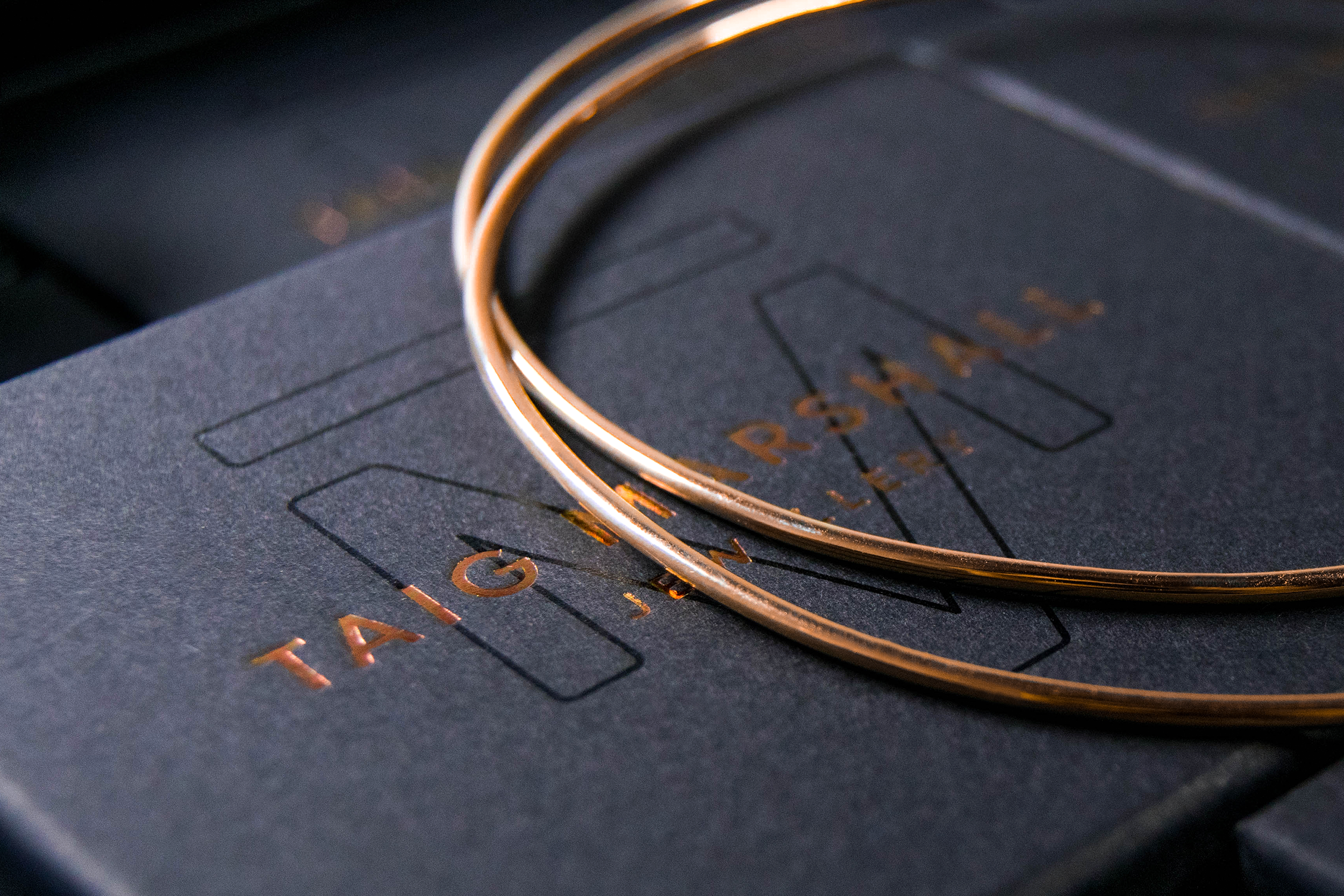
Taig Marshall is a master smither whose attention to detail and expert craftsmanship has earned him the reputation as one of Cape Town's favoured jewellers. Taig favours simple and elegant design so I wanted the branding and packaging to echo this.
Photography
@photography
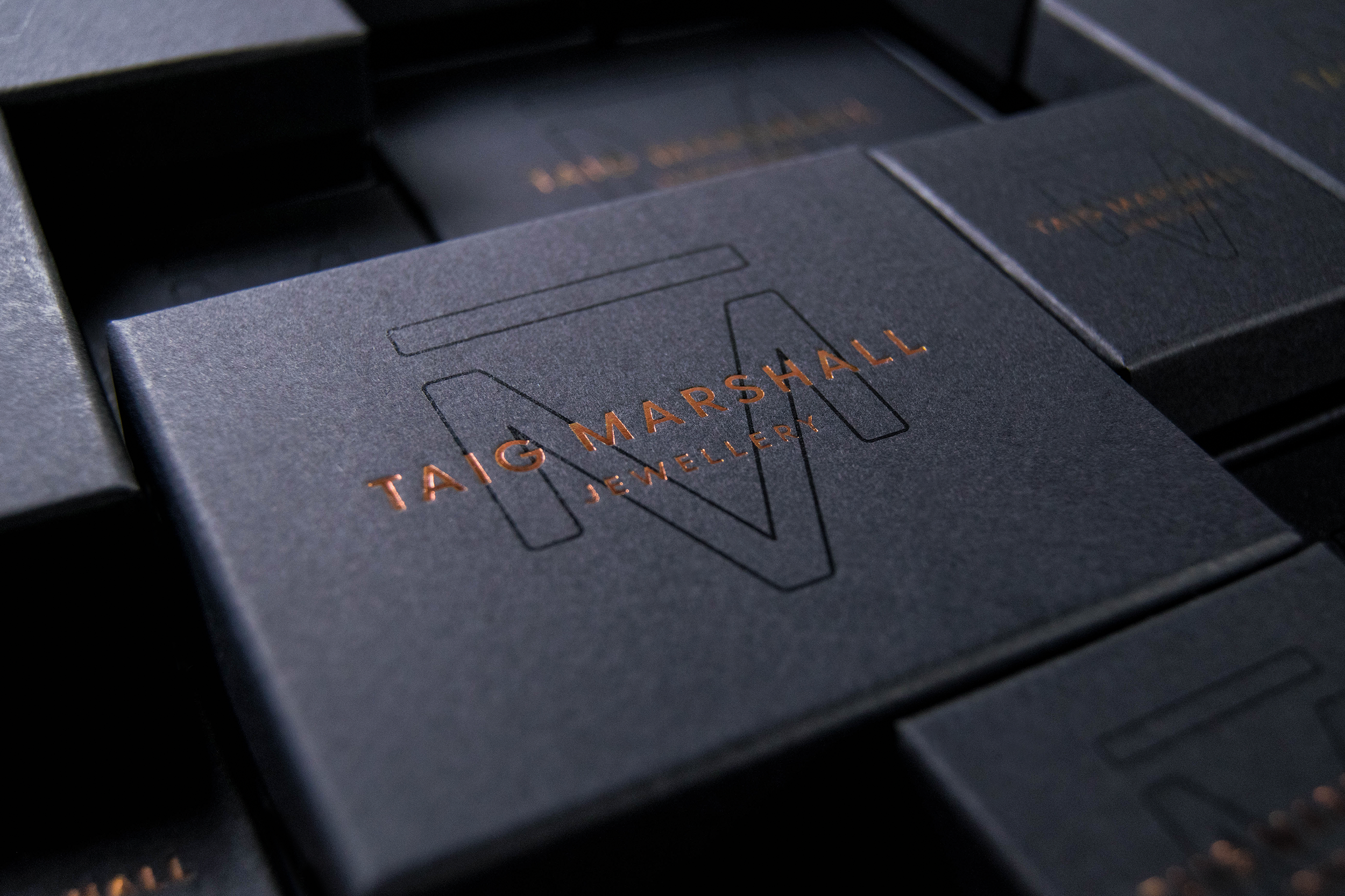
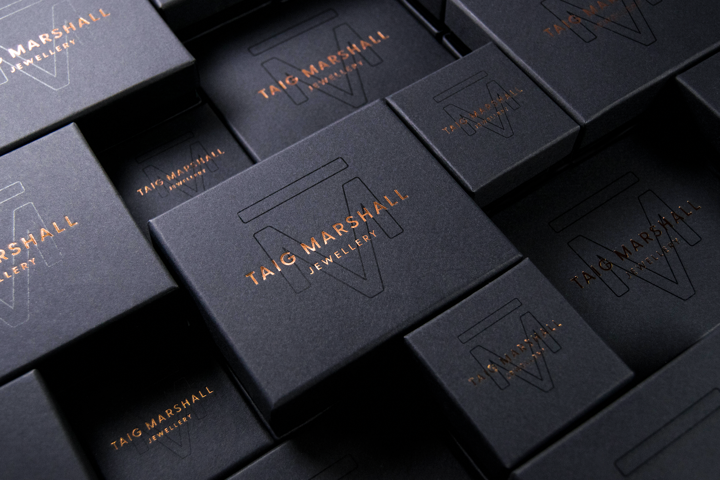
As with many tradesmen, Taig Marshall has a range of dazzling products, but no brand design. Ginger Strom essentially had a blank canvas, which is my favourite kind. I created a logo toolbox that consists of elegant contemporary typography with an iconic and modern monogram. This could be used as a pattern graphic element which is the dominant feature and icon for the brand. The bronze and matt black colours pay homage to smithing and are a striking combination.
I needed to create a bold and elegant logo and icon that would be distinctive in a saturated market. The logo also needed to transition seamlessly across the web, print, and packaging.
The logo design consists of a wordmark and icon that can stand alone or work together. The outlined icon is sophisticated and contemporary. The logo is always executed in black foil on black surfaces or as a UV varnish to adhere to Taig’s ethos around simplicity and elegance. The wordmark typography is clear and presented as a bronze foil atop the icon to add a feeling of contemporary luxury. The identity juxtaposes the masculine edge of the designer with the elegant, sophistication of what’s inside the box.