_PACKAGING_IDENTITY_STRATEGY
Cecilia's Farm
How I updated the original branding to bring a renewed freshness and luxury to dried fruit.
Cecilia’s Farm is a six-generation family business that has established the legacy of producing some of the best dried fruit in the world.
3D Rendering
@mf3D
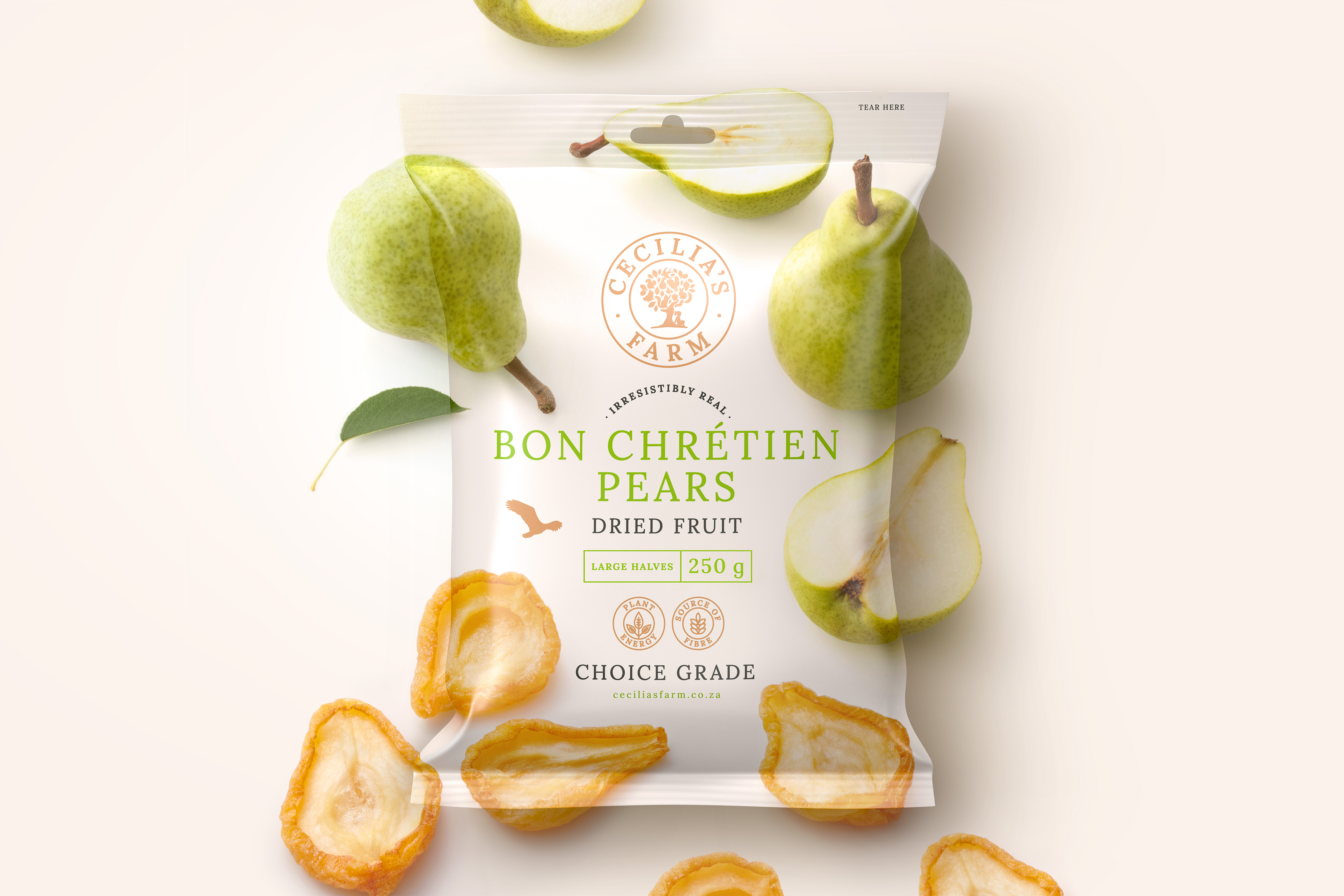
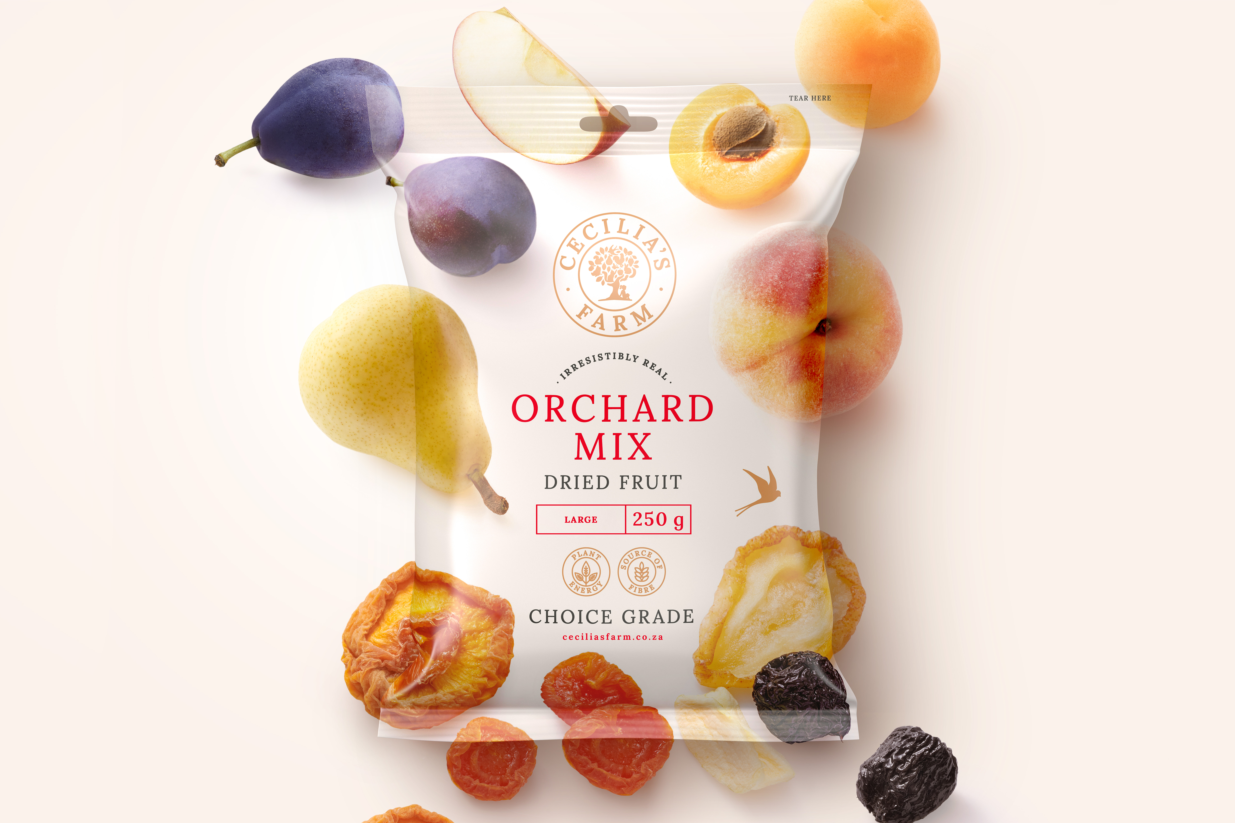
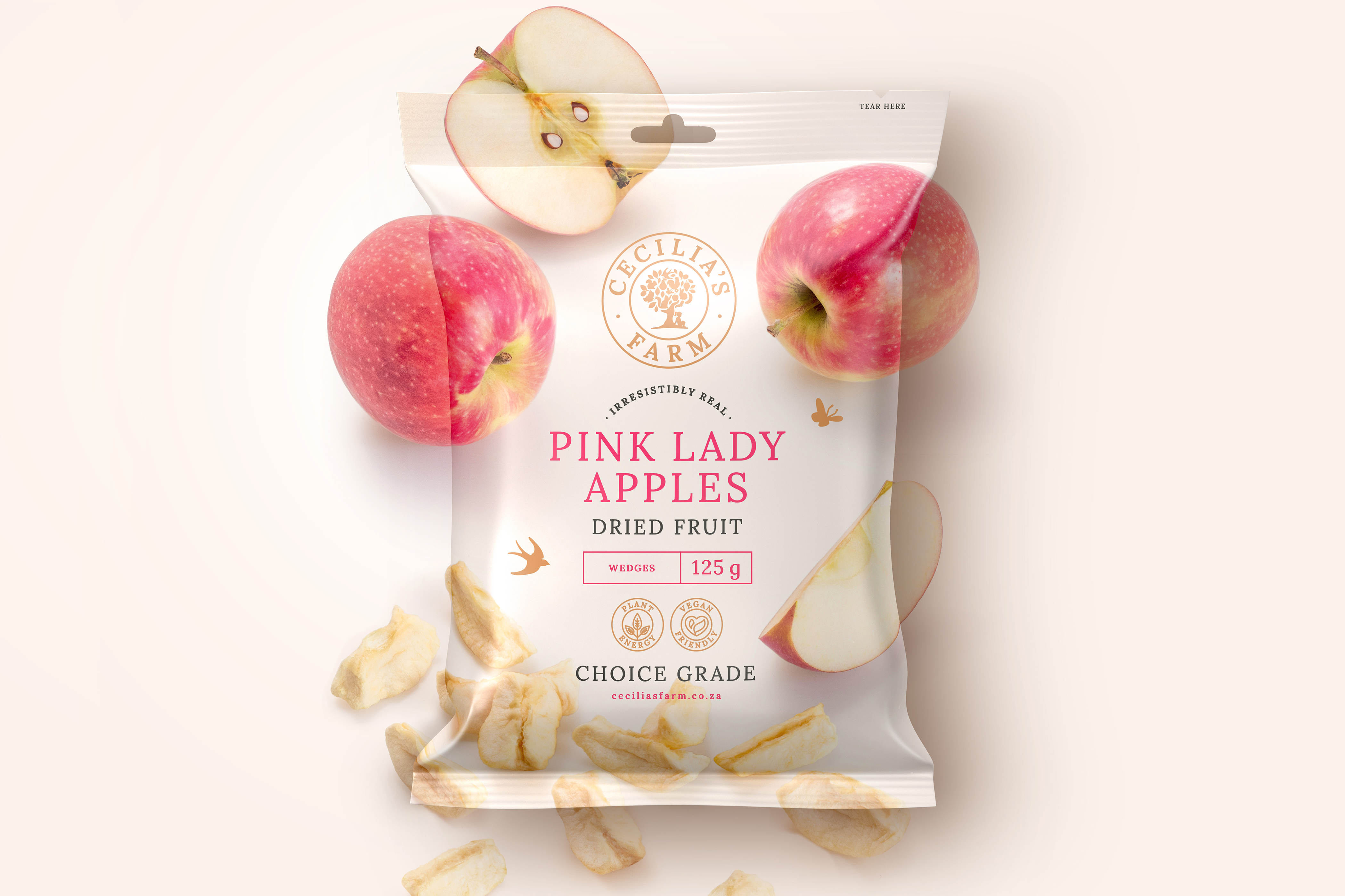
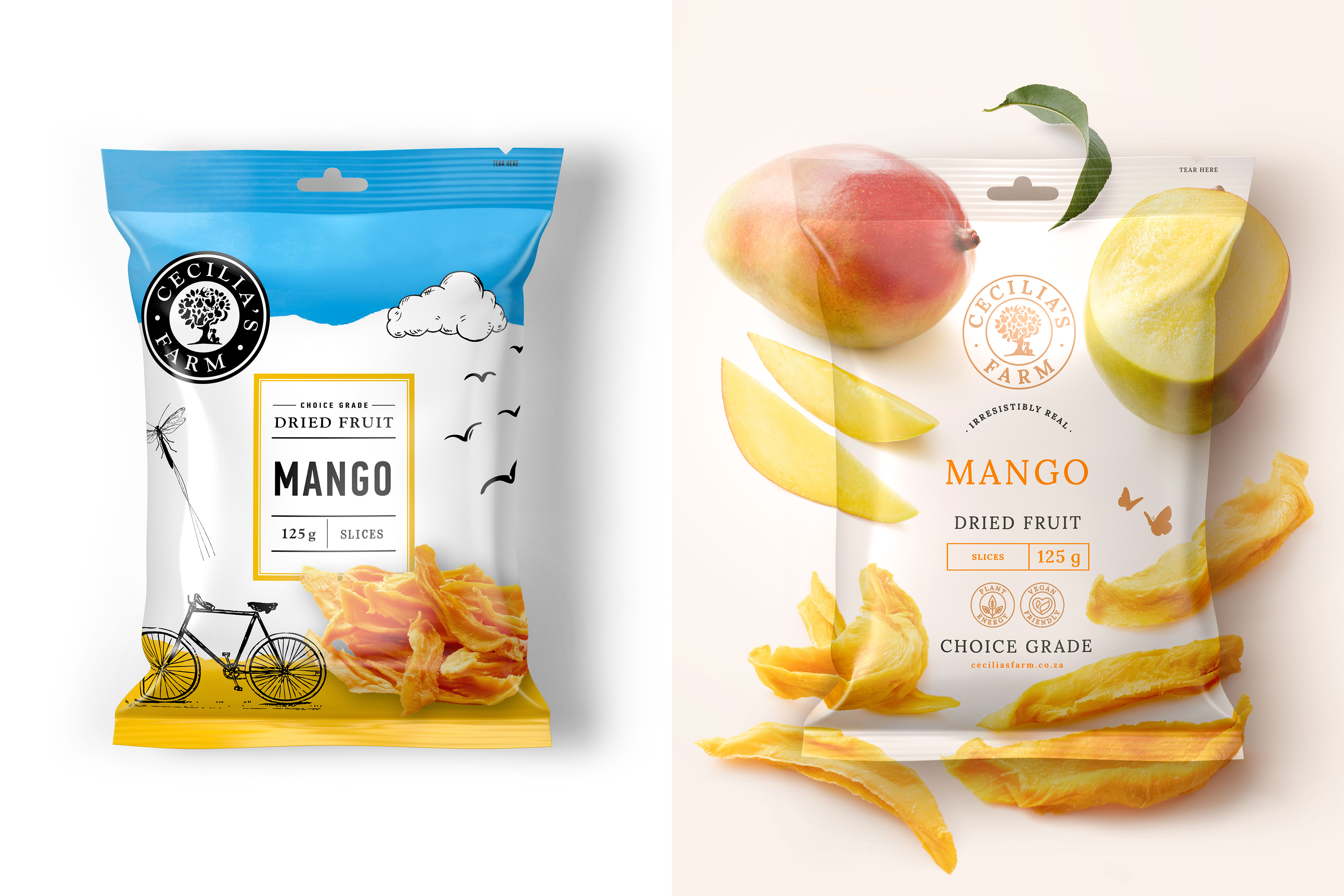
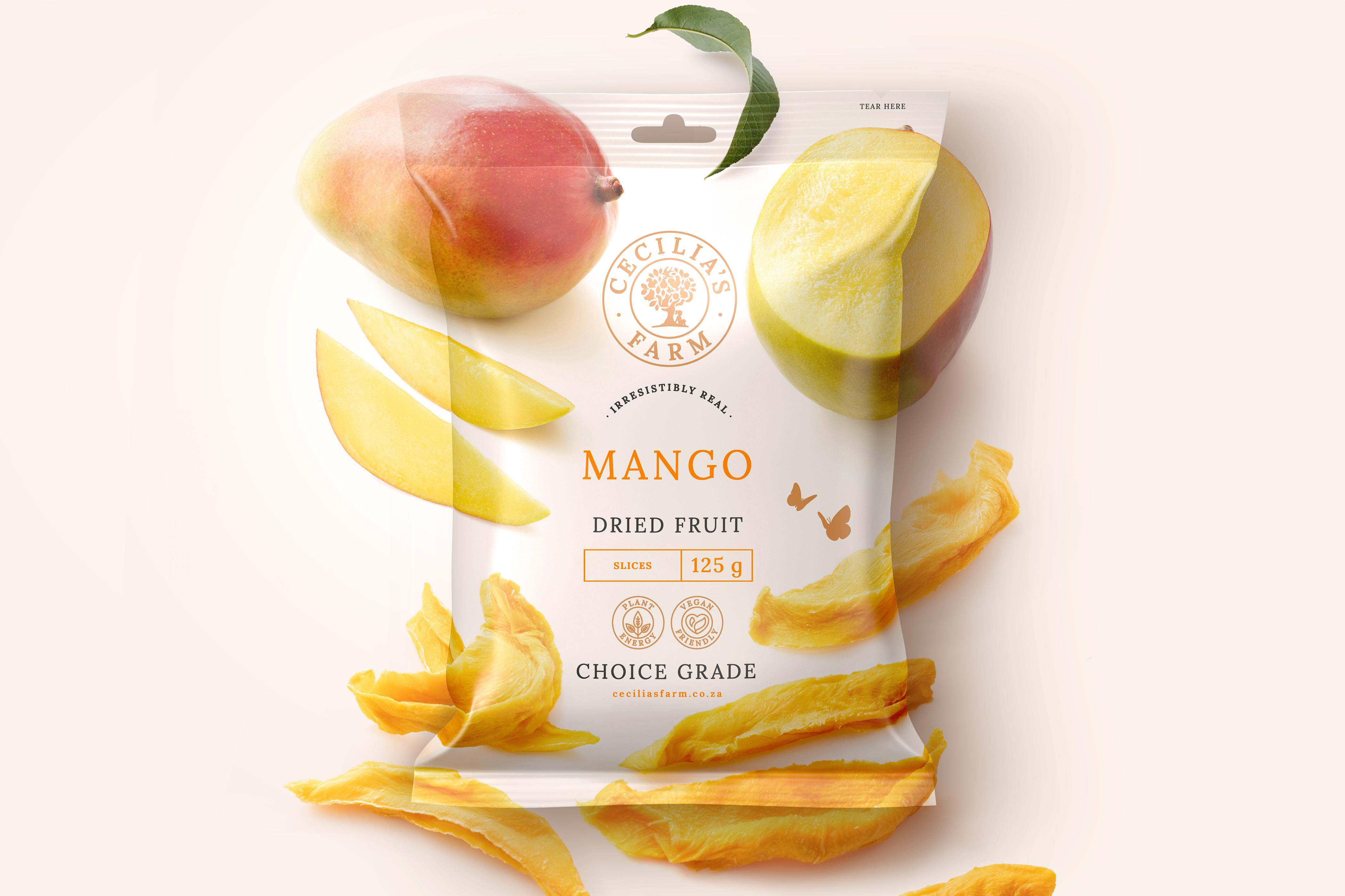
Cecilia's Farm wanted a strategic direction and a packaging execution solution to position them as a world leader in the dried fruit industry. They wanted to situate their products as premium and luxurious, while also moving away from the dried fruit market trend of favouring quirky illustration-style packaging.
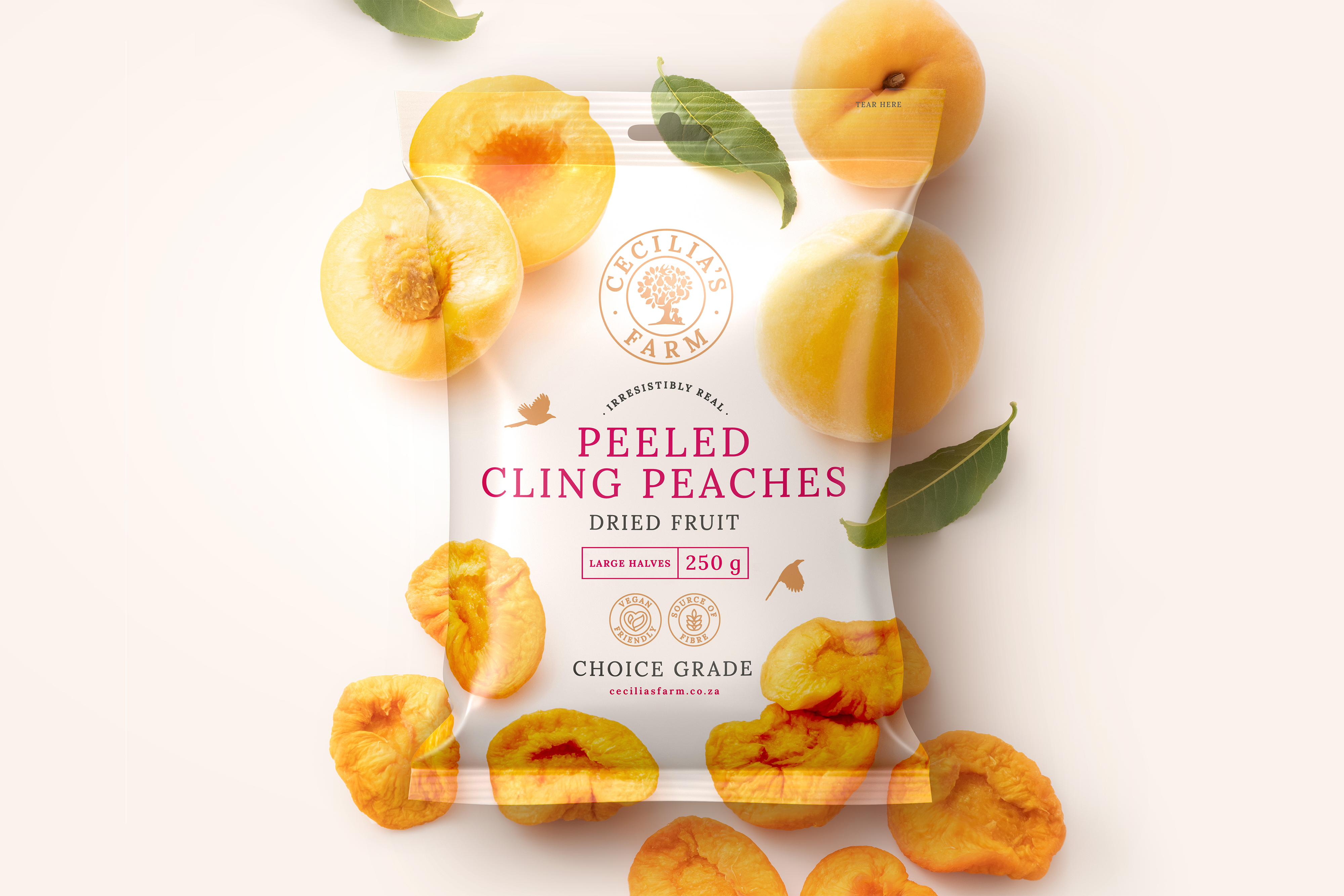
To highlight luxury, the logo evolved into a contemporary typeface with cleaner execution. Ginger Storm added a premium element by replacing the harsh black brand colour, with a warm bronze that ties into the mood of farming and producing dried fruit.
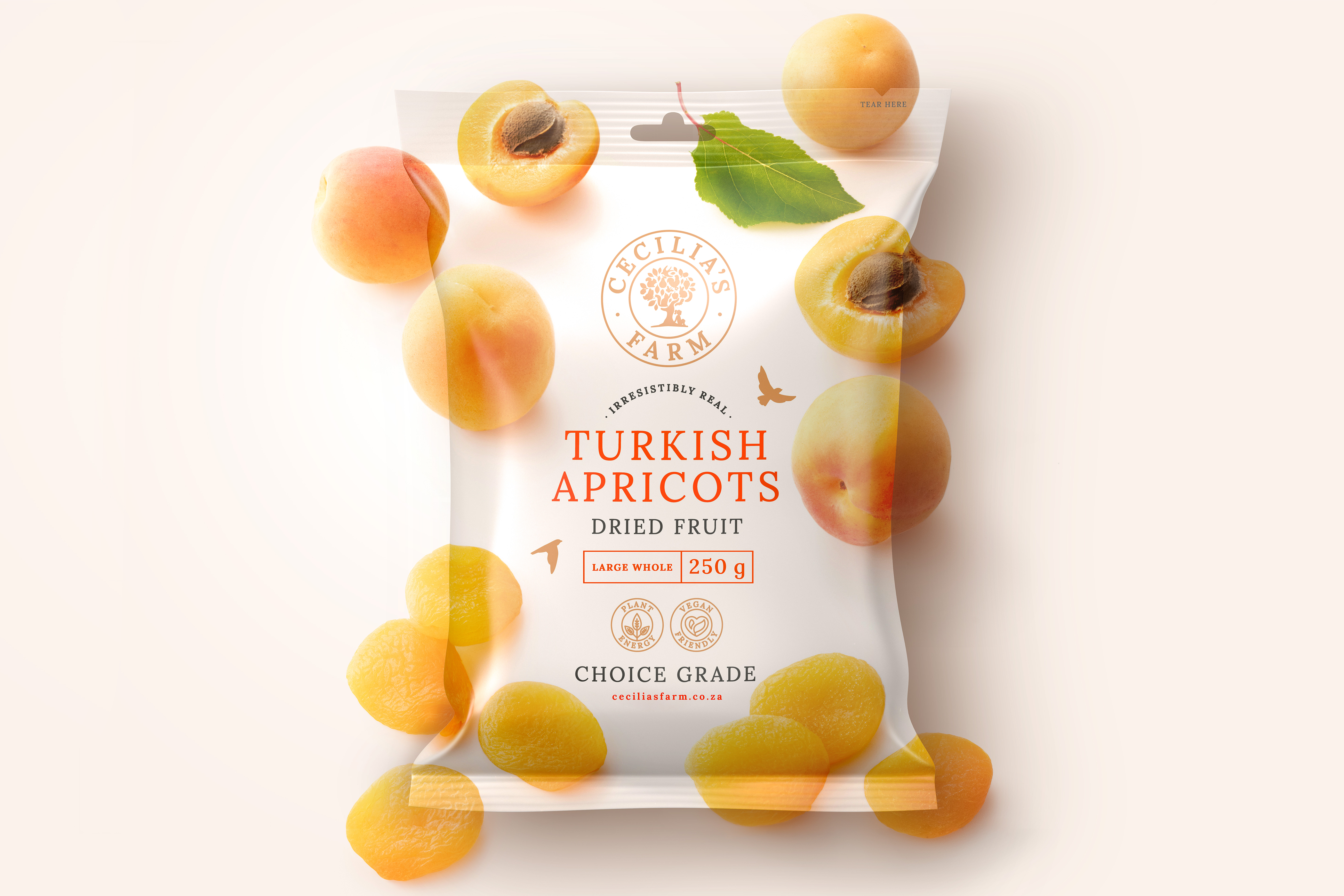
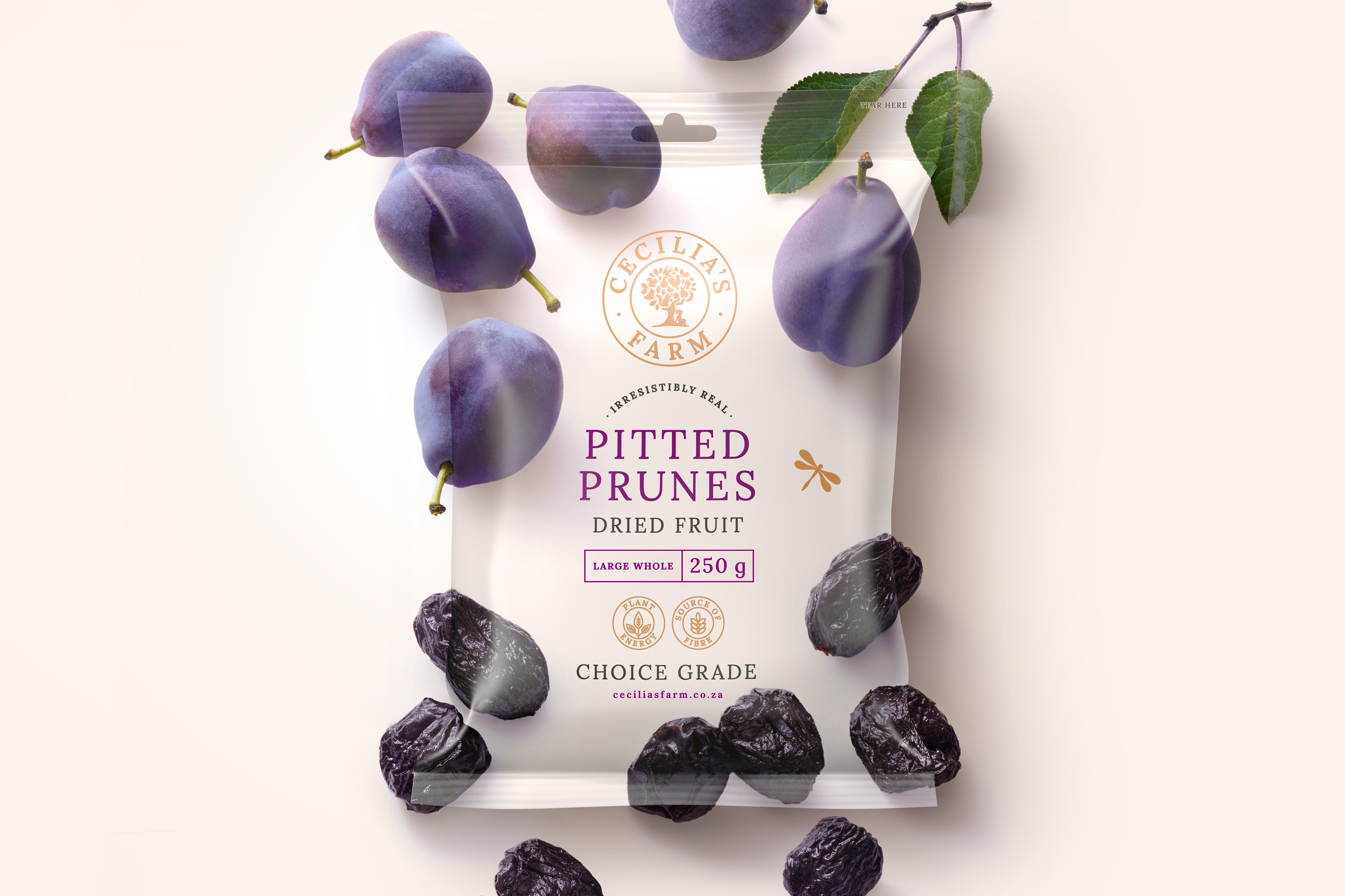
A classically crafted and elegant typography grid allowed for clear communication, easy product colour identification, whimsical iconography, and a structure that is unique to this product category.
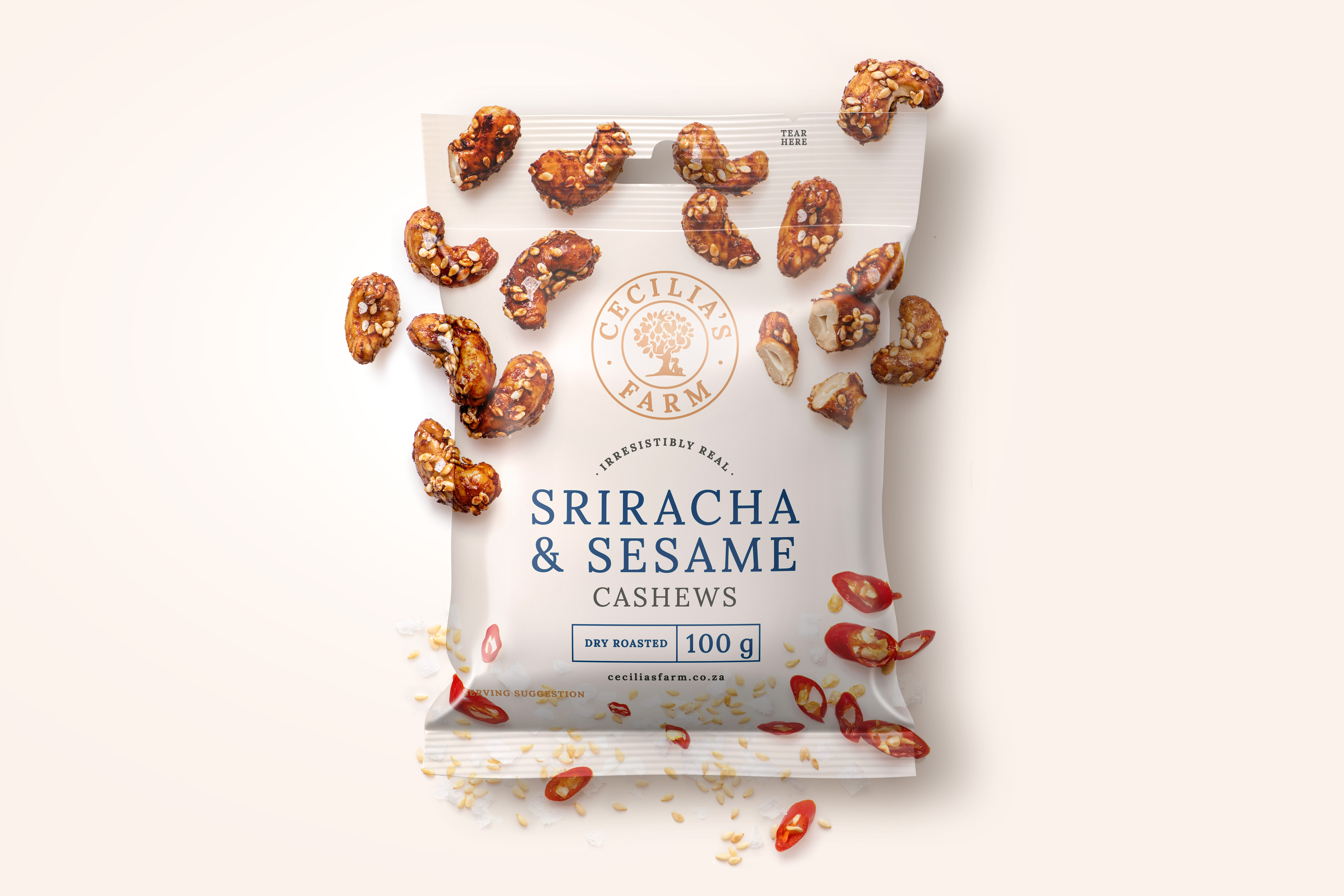
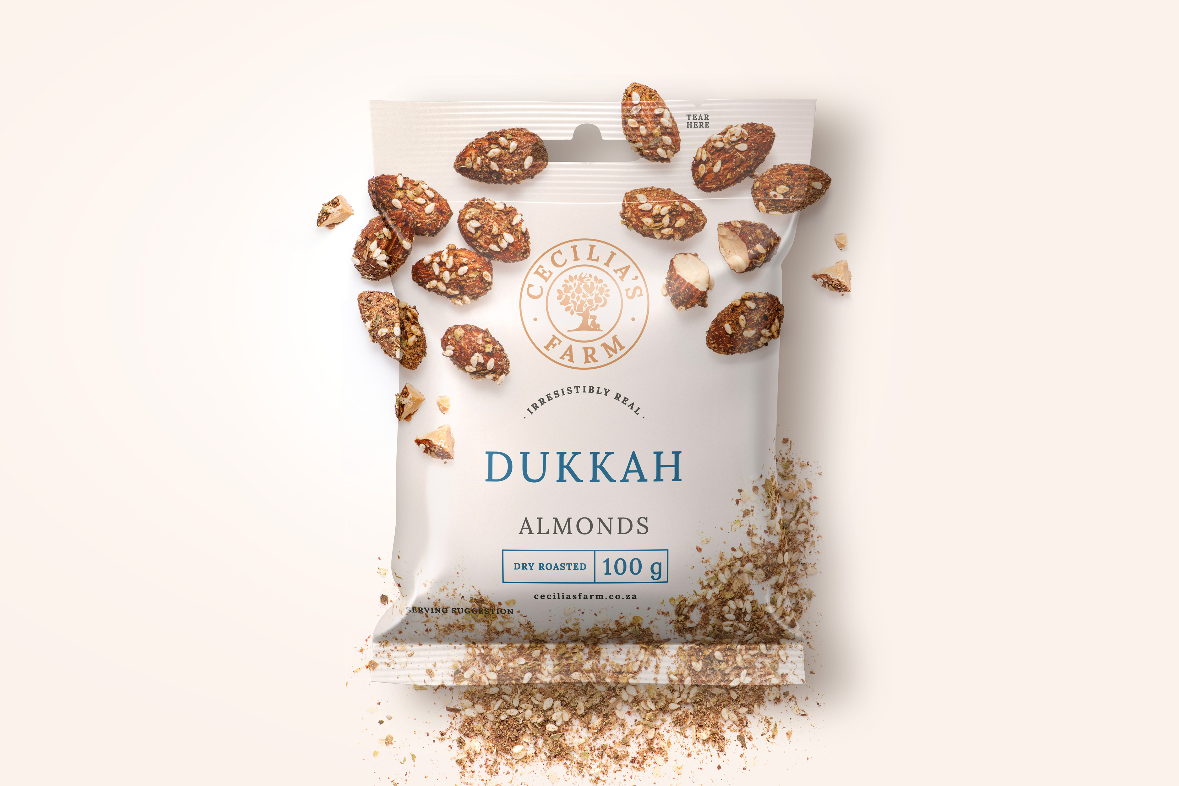
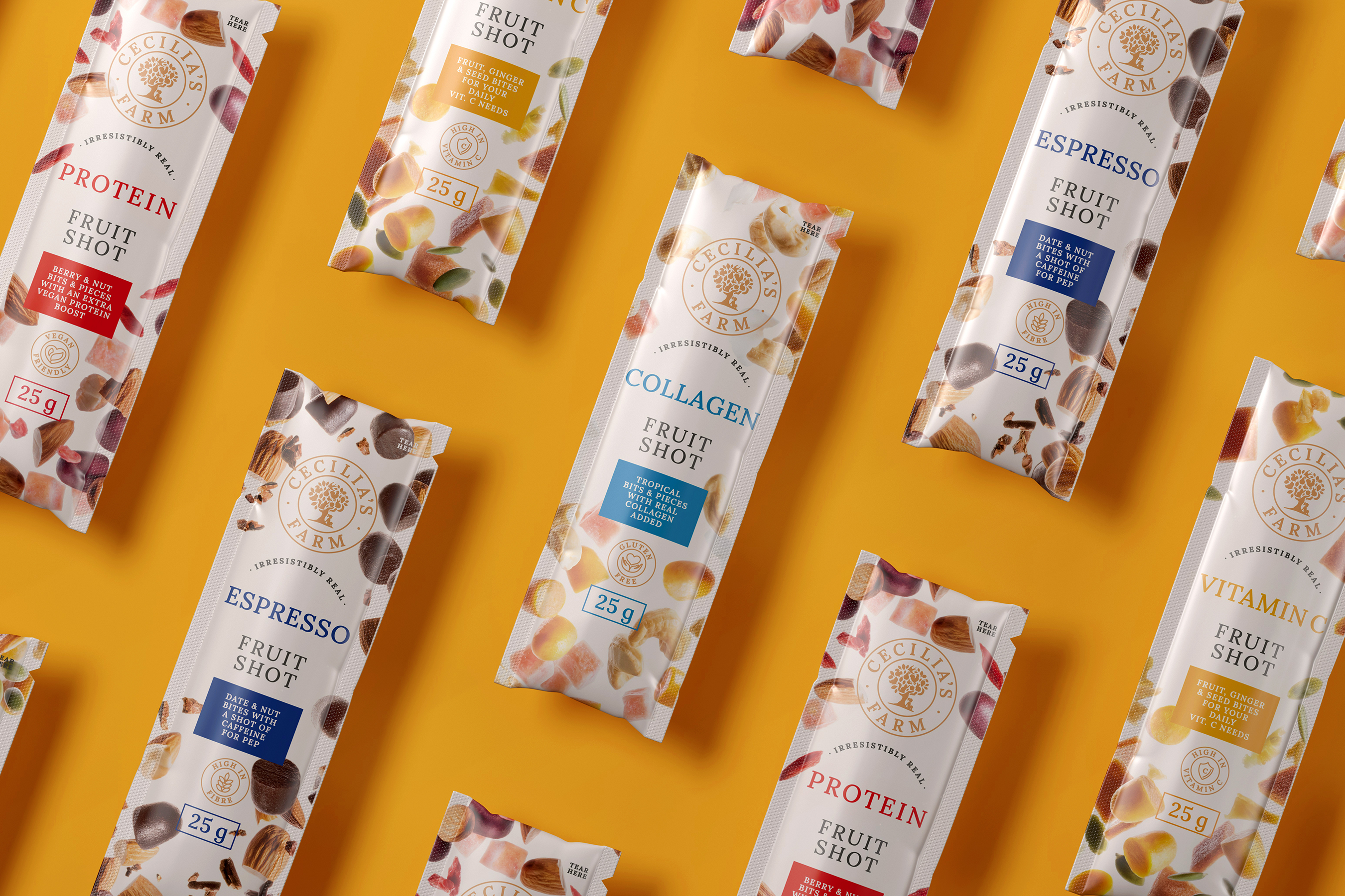
The showstopper for the brand redesign is the product photography. I wanted to create appetite appeal in packaging without any visible product. The mouth-watering world-class imagery communicates the production process that flows from the premium quality fruit to the final dried fruit product. The point of difference in the market guarantees that this producer has a competitive edge.
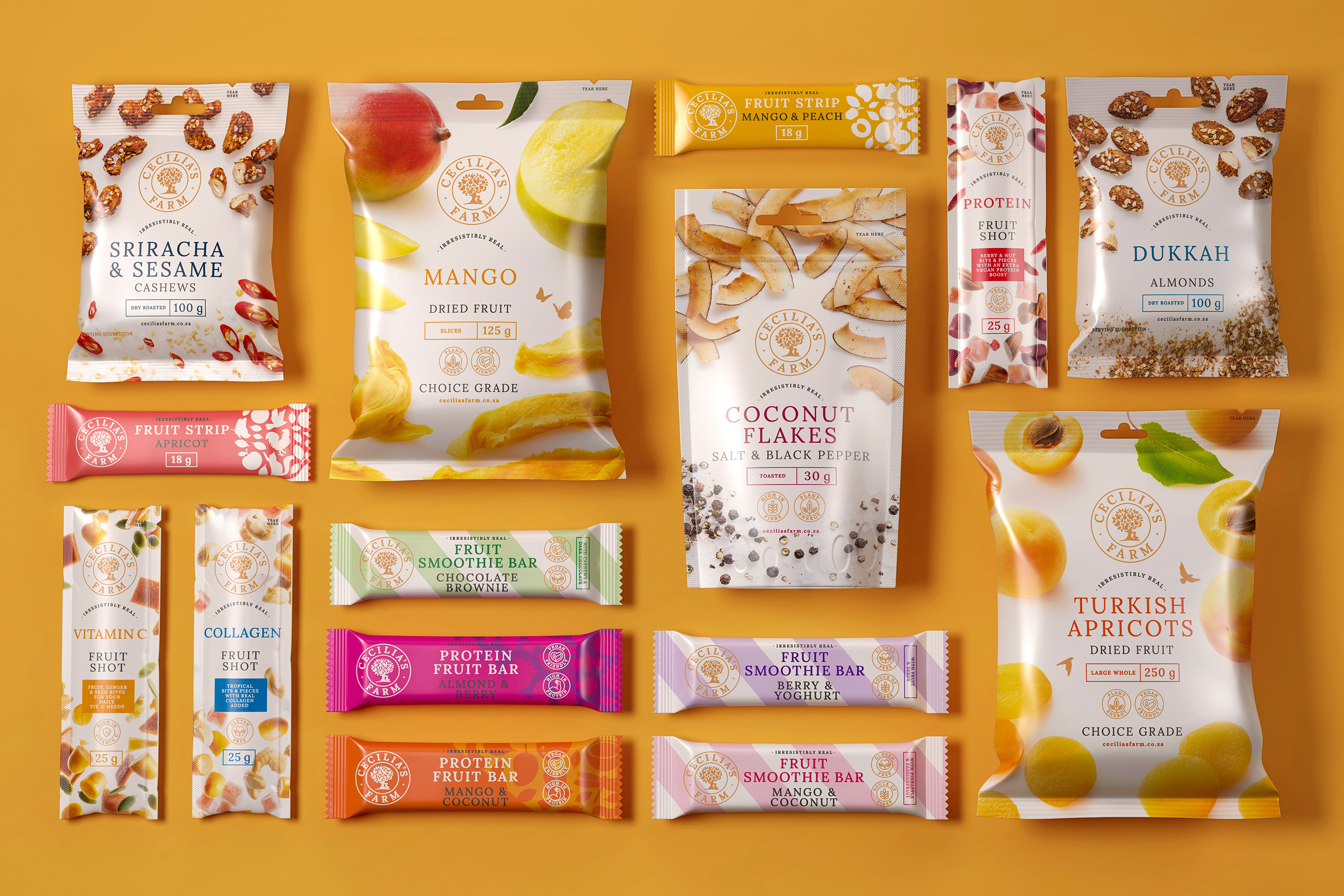
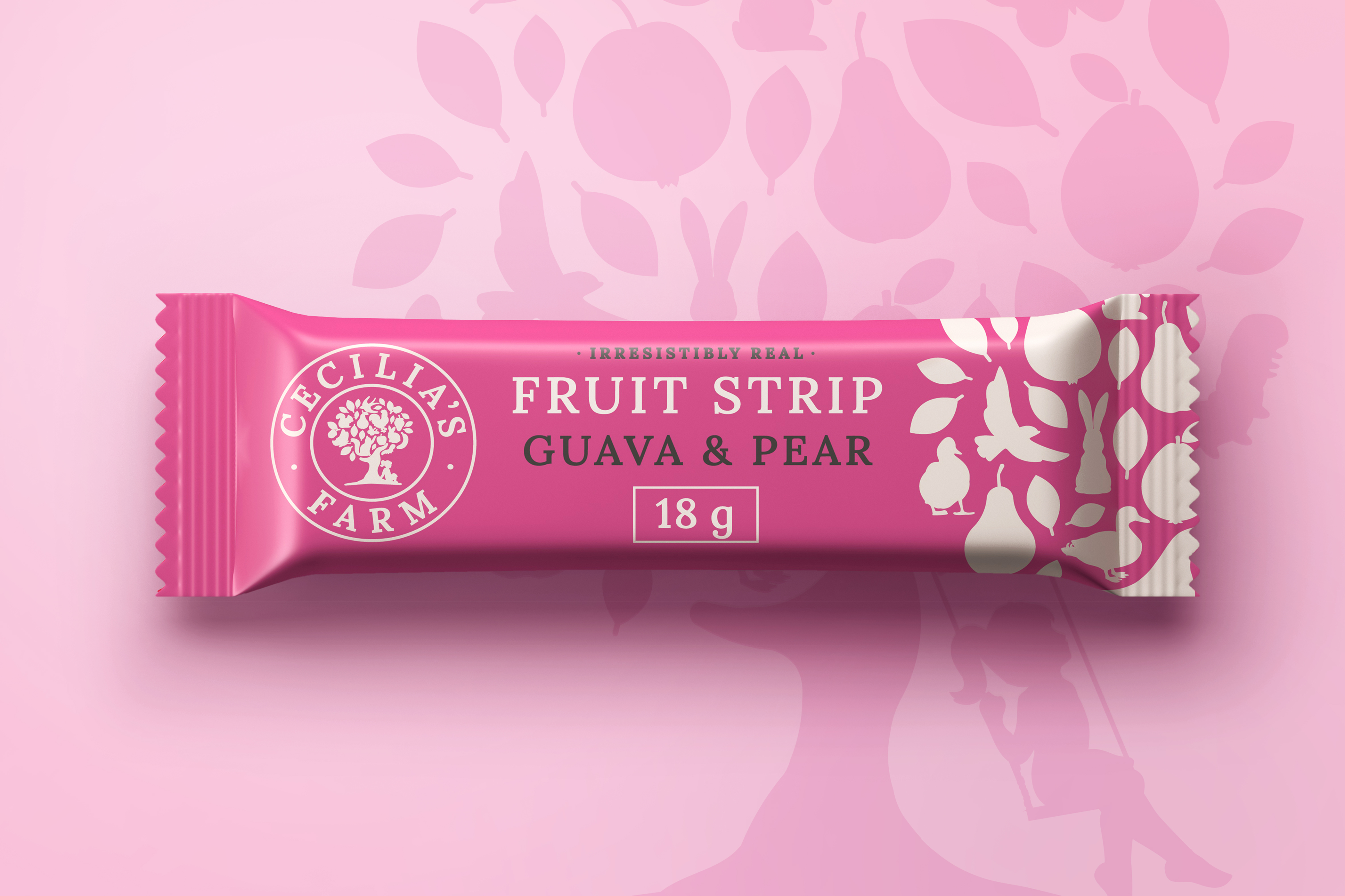
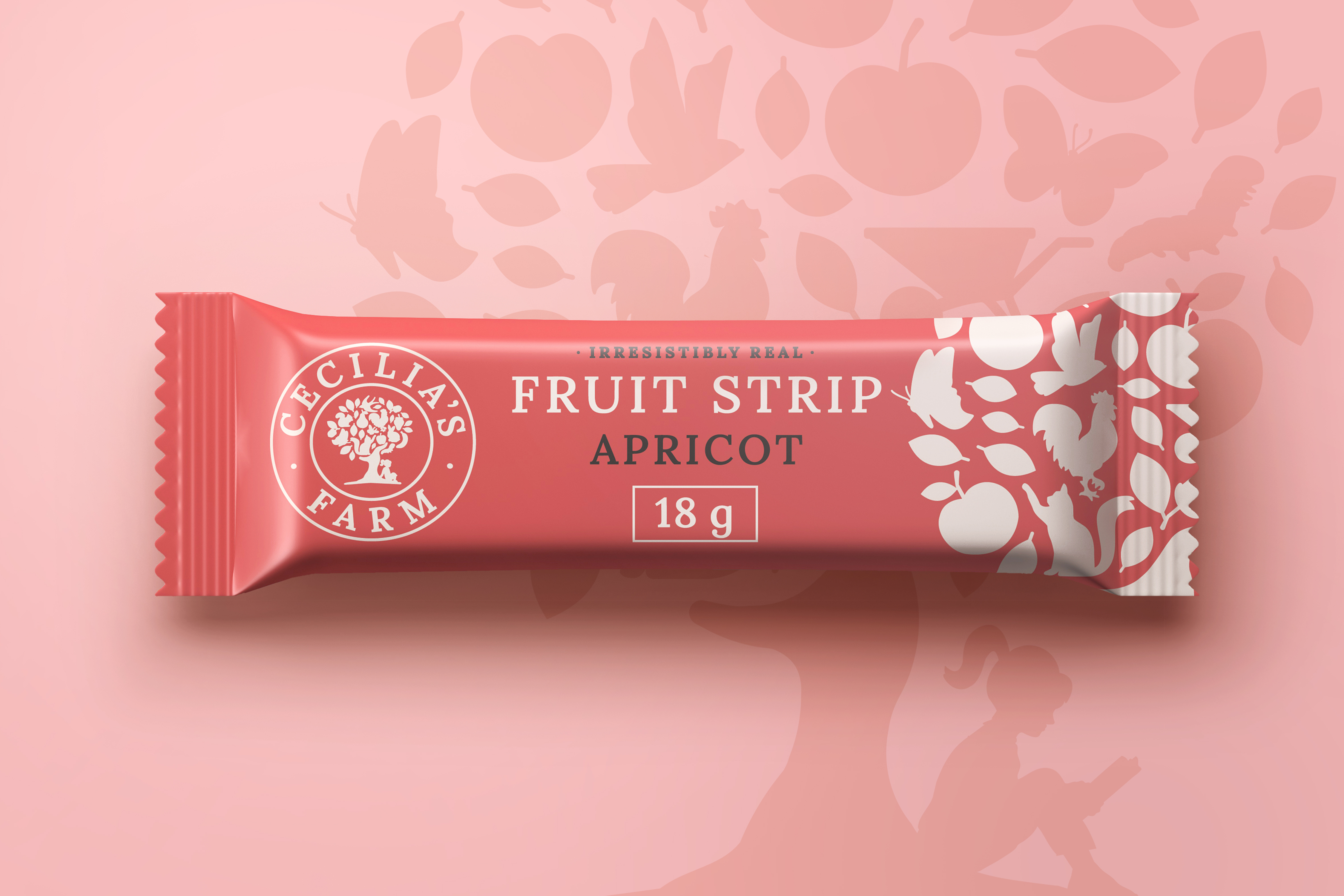
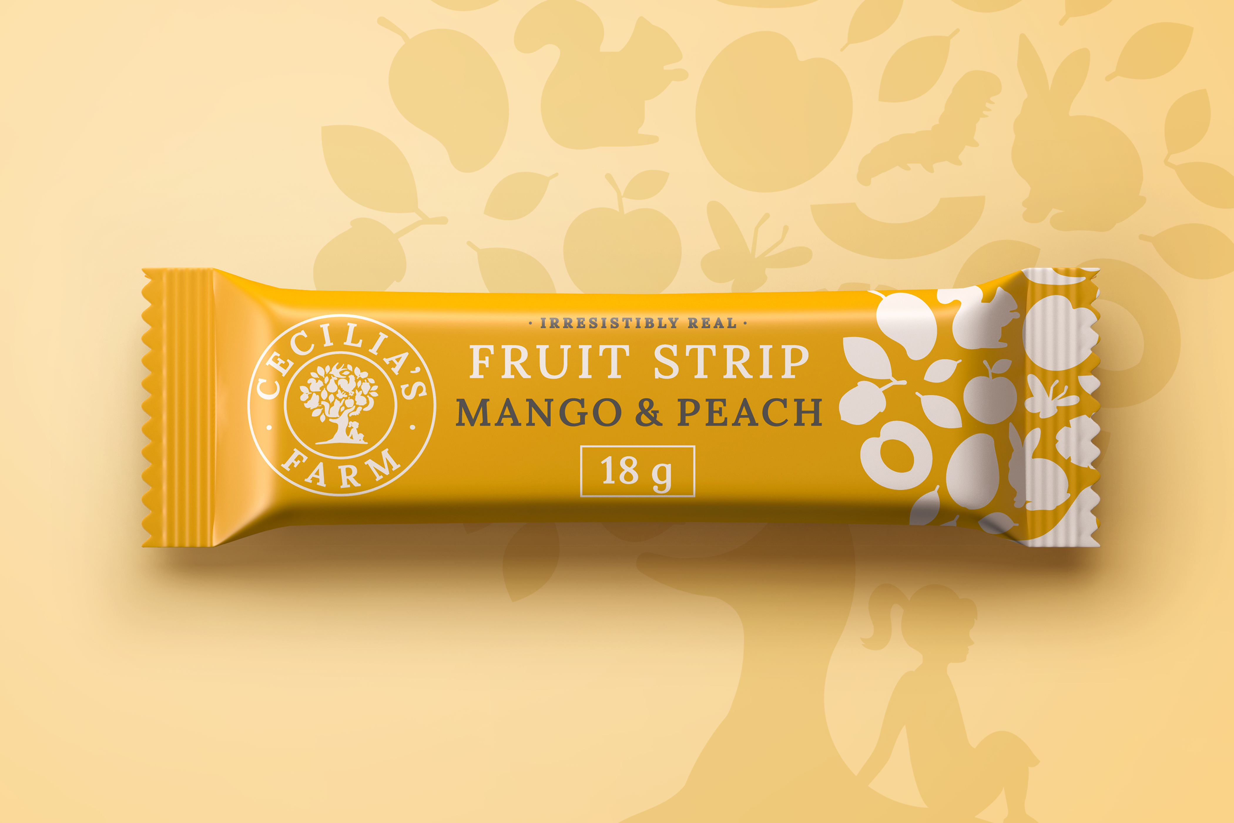
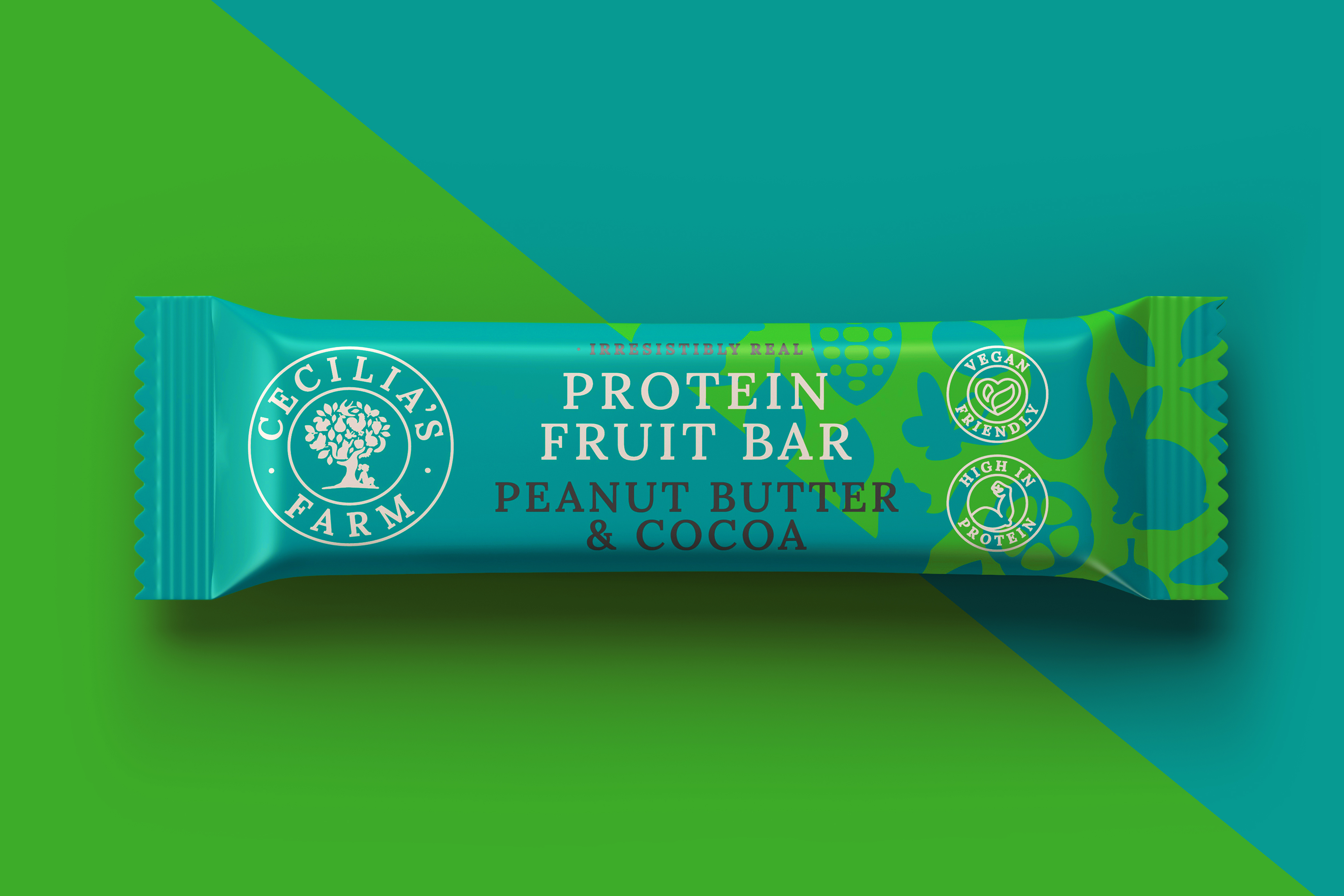
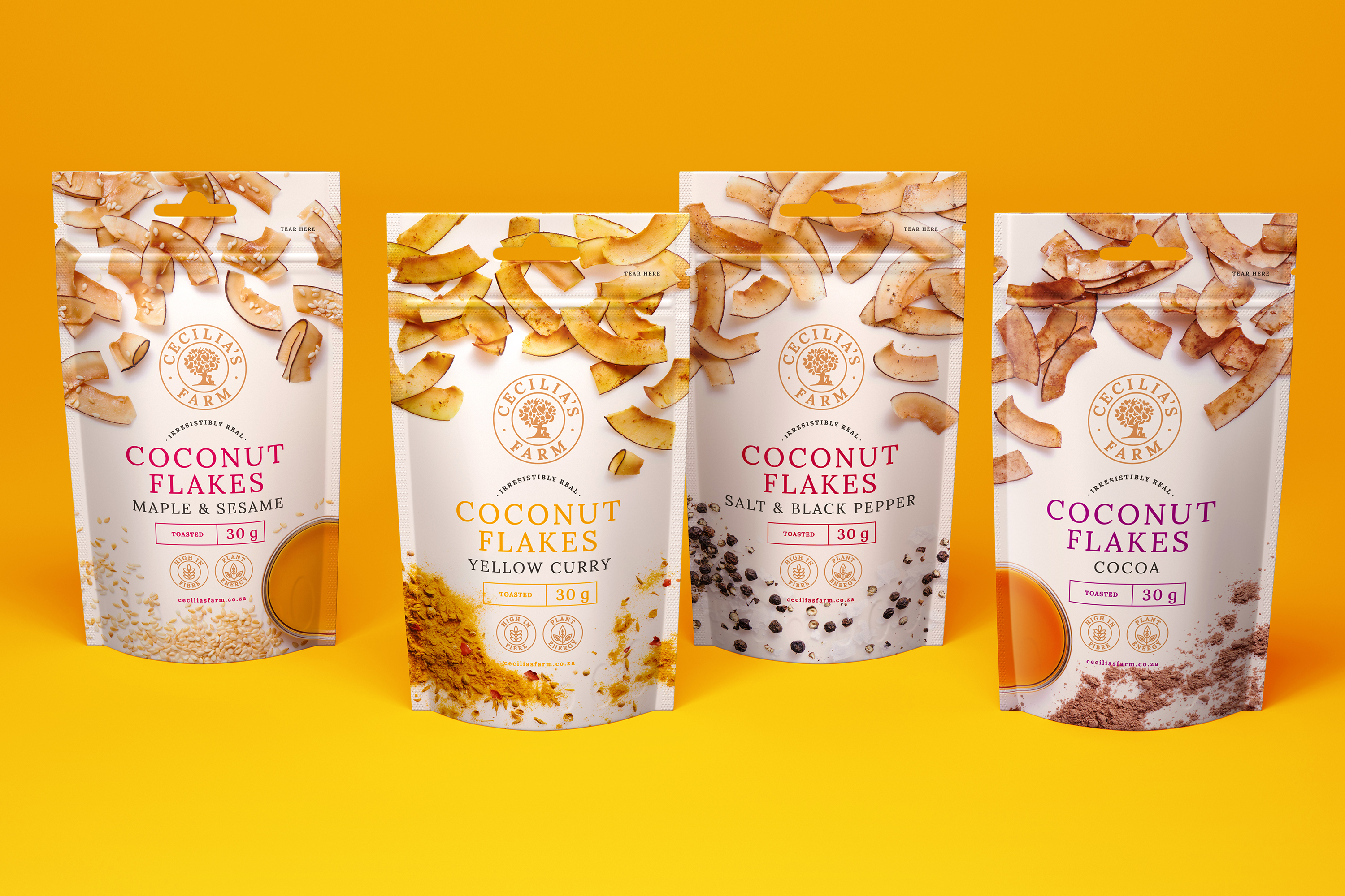
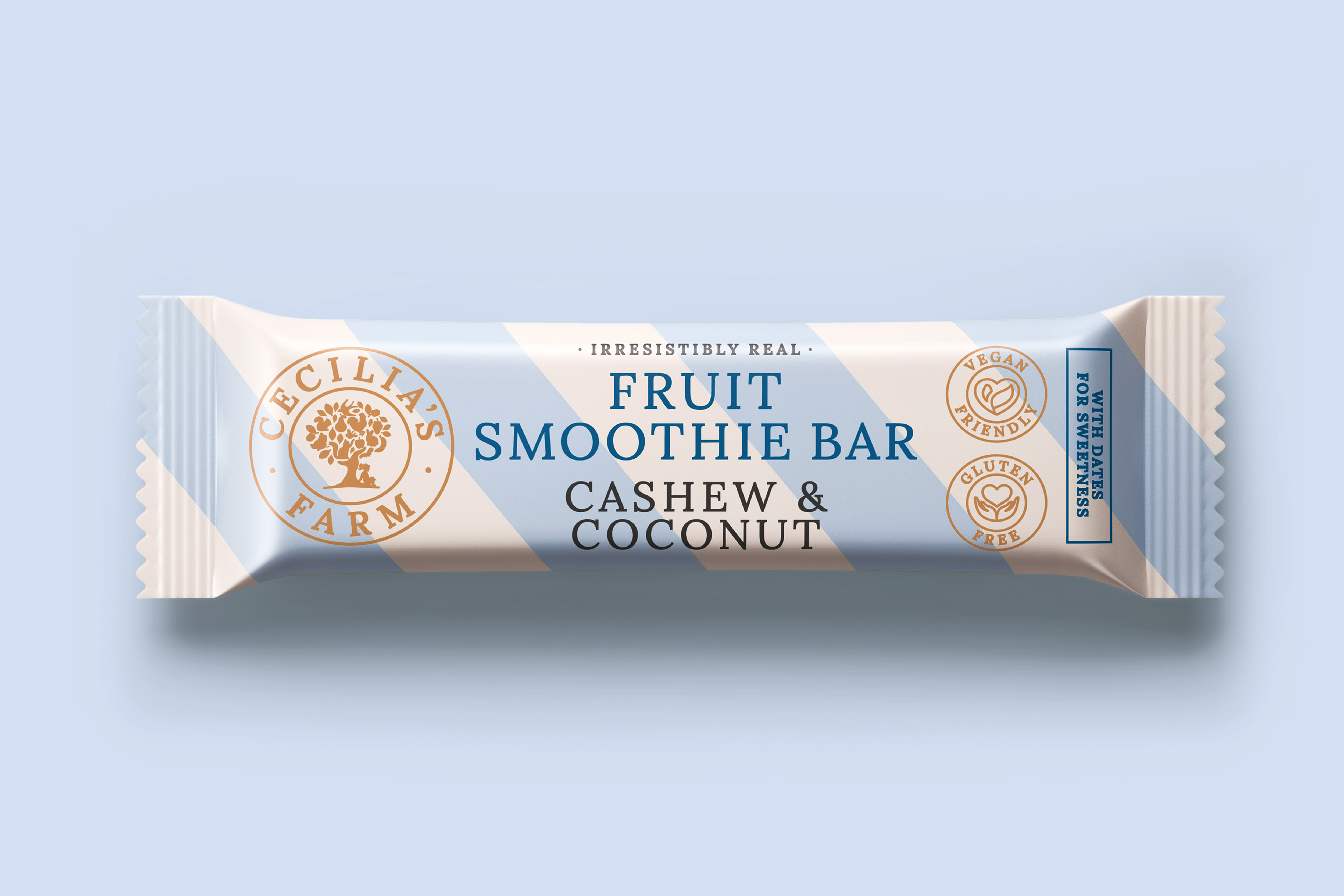
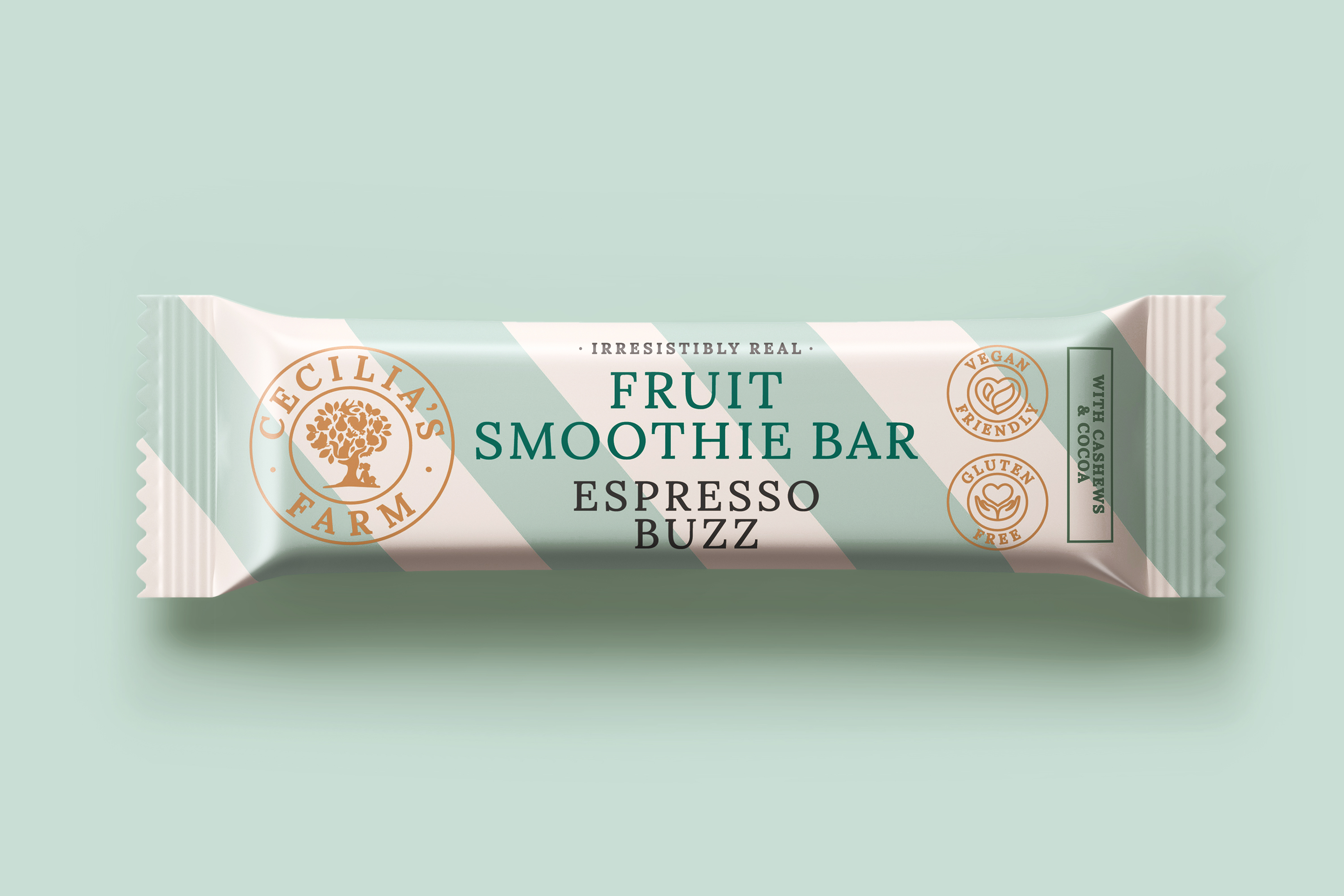
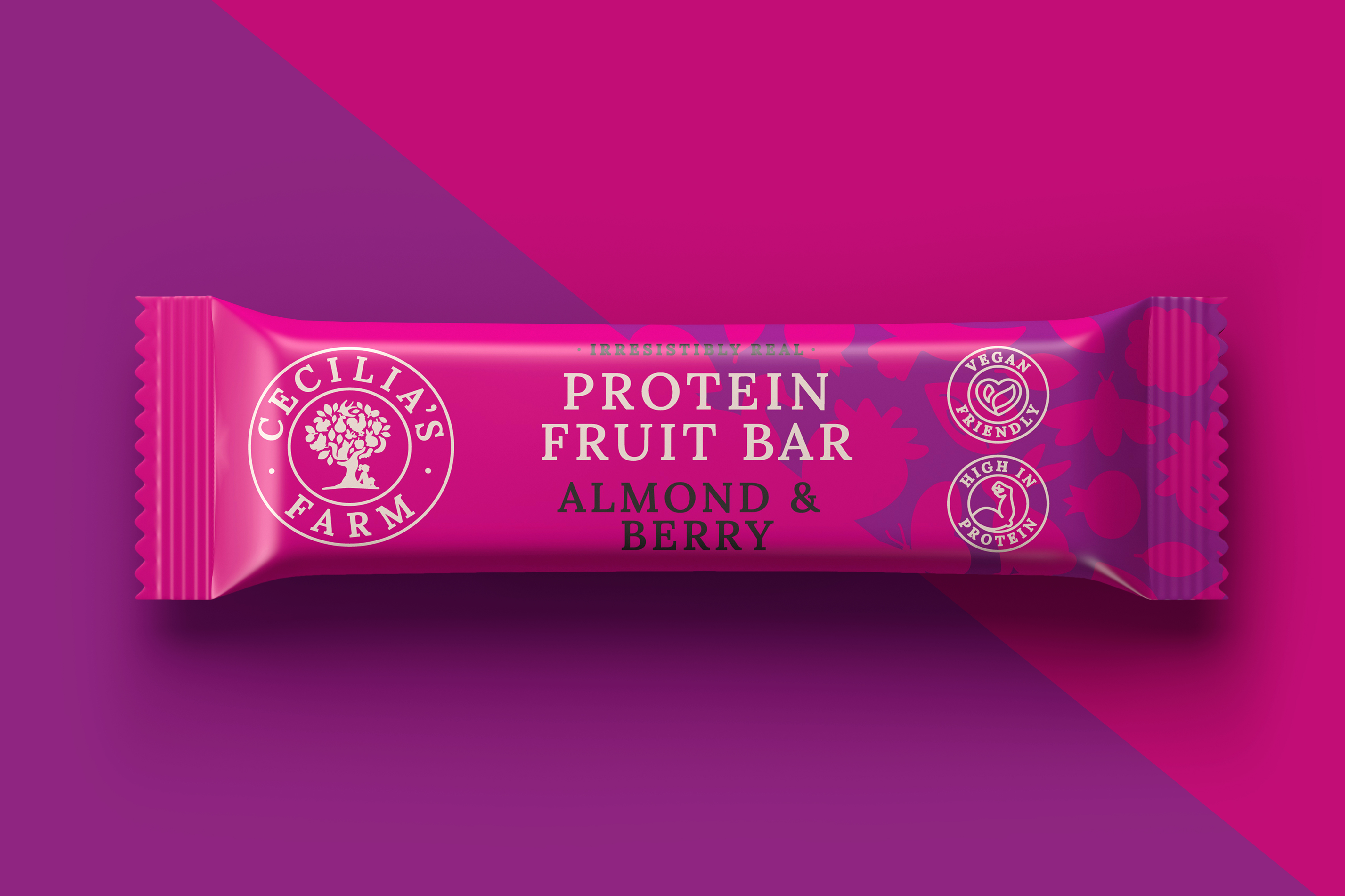
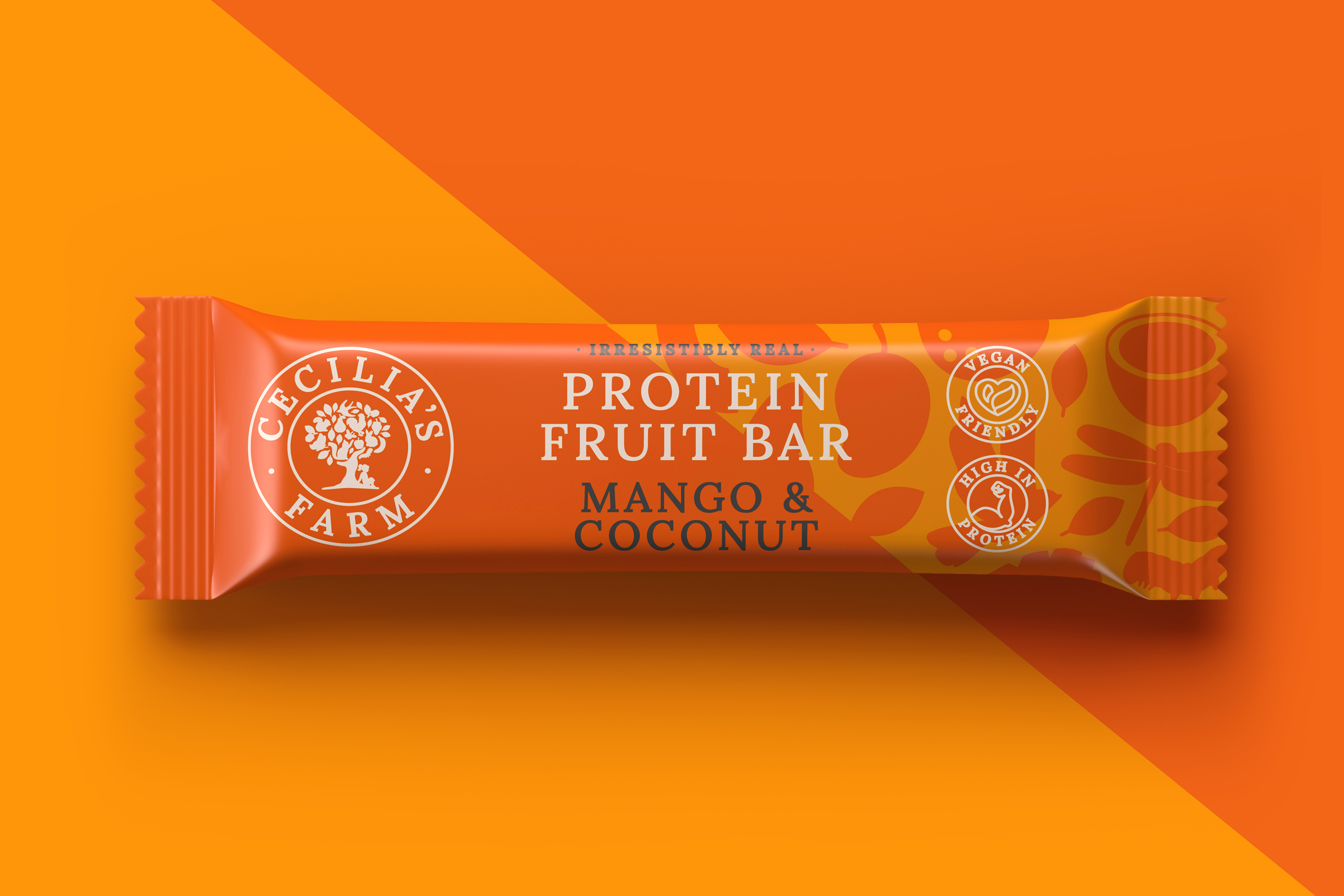
For the snacking range, Ginger Storm built on Cecilia's Farm's core line of dried fruit packaging that established the brand as a premium, luxury product.
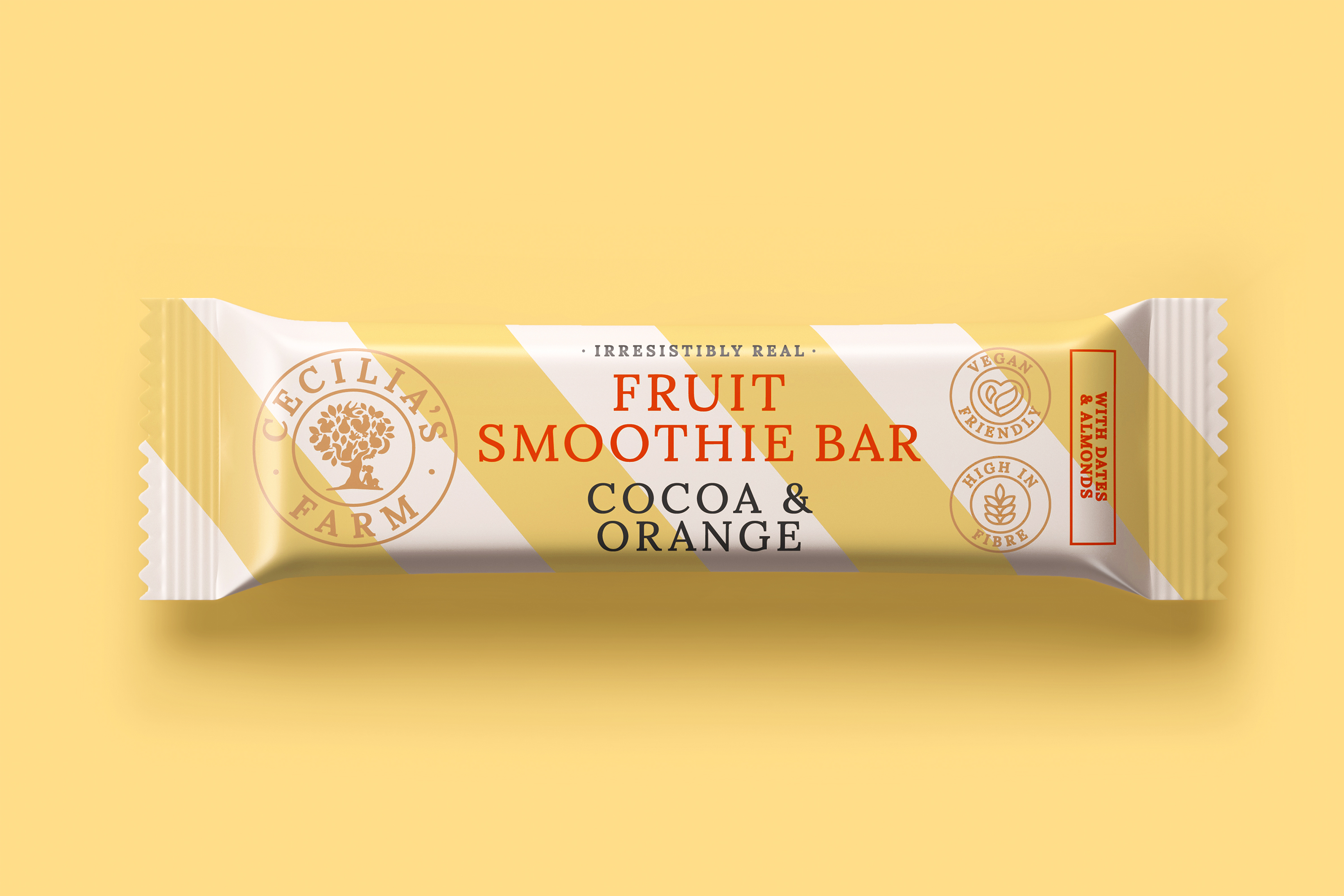
I carried Cecilia’s Farm identity across their snacking range in a playful, vibrant, and colourful manner. The strong brand identity is visible in the crafted, elegant, contemporary typographical structure and iconography. The brand architecture is carried cohesively across multiple category lines, while still maintaining individual personalities.
The whimsical brand personality comes to life with the individualised character of each bar. The diverse graphic execution of the logo illustrations furthers the brand identity and allows consumers to explore and discover elements within the illustrations.
