24 May 2024
_creative insights
How do you make a brand a legend?
Some brands have become part of our cultural narrative and zeitgeist. They wedge themselves in pop culture and go into the annals of history. Every brand wants to reach this zenith. The pinnacle as it were.
By Storm Wiggett
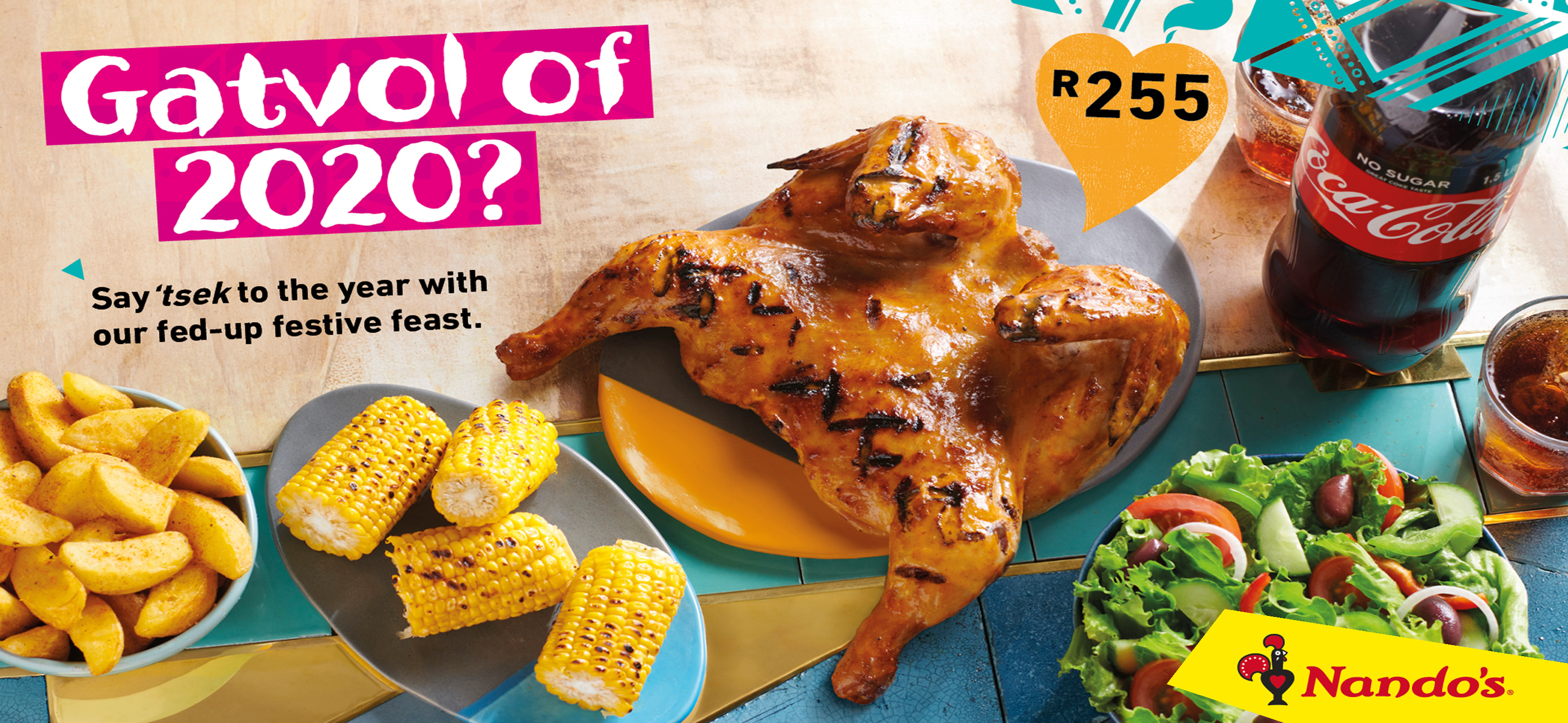
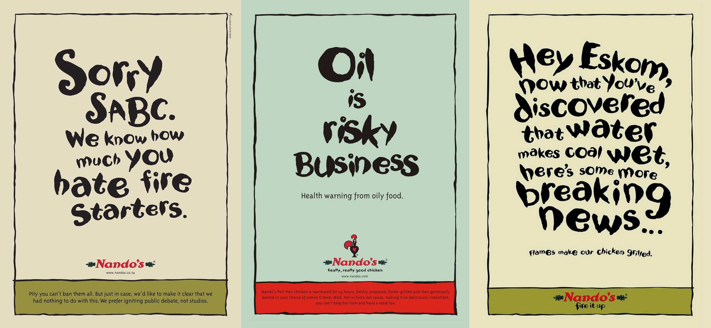
Anyone in South Africa knows Nandos– if not for their chicken, then for their quick witty satire. They’ve become a beacon of light when Eskom load sheds, our politicians lose the plot again, or our sports teams fail us. Nandos speaks on behalf of an entire nation. In the UK, and now thanks to the Internet, most of us eagerly await the “Best Christmas Advert Wars”. We wait in anticipation to see which supermarket chain will conquer all and produce the best advert to tug on our heartstrings and secure that supermarket top of the pops status.
Whatever your role in creating and developing a brand, one thing is for sure, if there’s no story, then you’re facing a losing battle.
Here’s what I know
Barry Schwartz’s excellent, The Paradox of Choice explains why more is less, and why humans are so anxious. We are absolutely inundated with choice. For our basic human survival, we need food. But, an average grocery store reveals that food is no longer basic, in fact, it’s incredibly complex… There’s so much choice. The average American supermarket stocks about 30 thousand items.
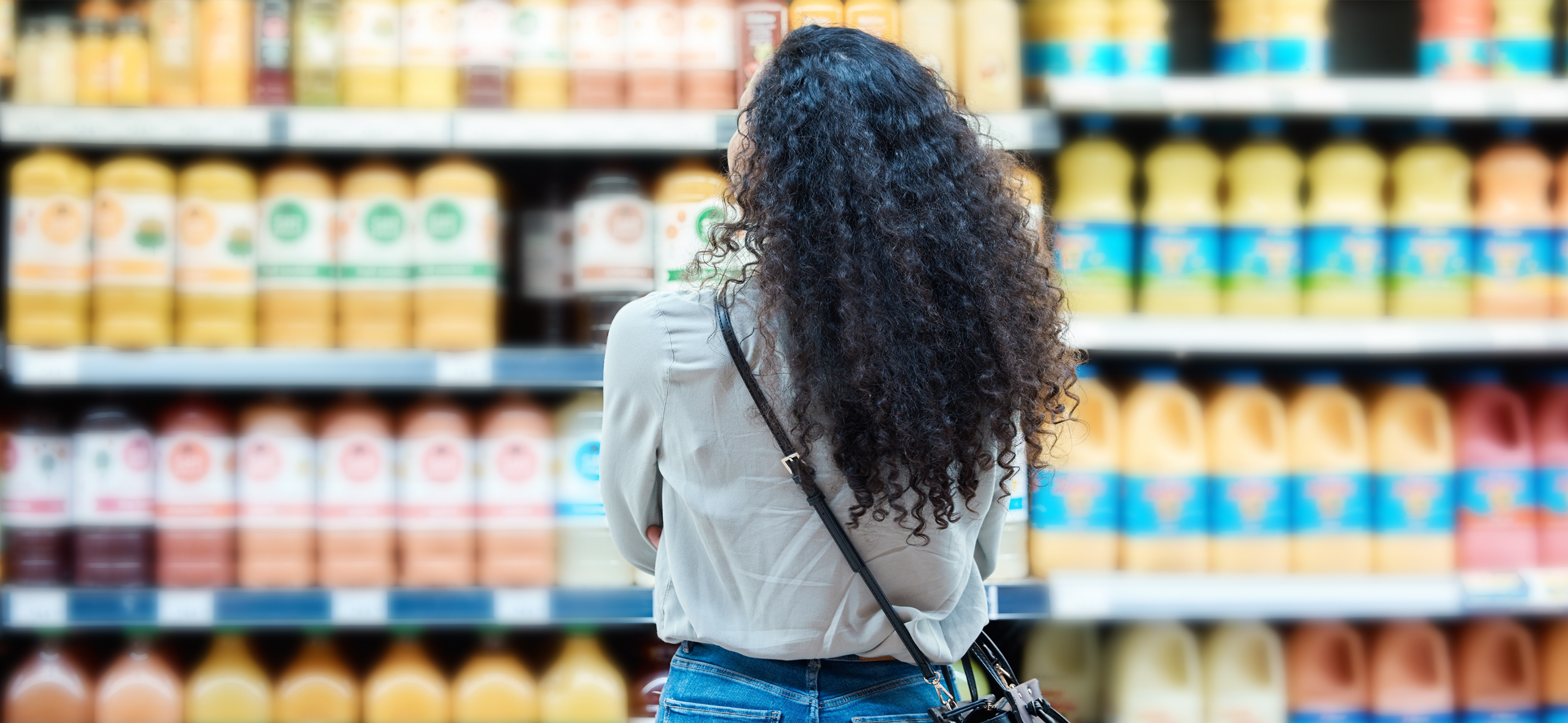
If we consider this from a packaging perspective, how do you situate your brand and get it to stand out? Competition in retail stores and online is tougher than ever with multiple products competing for our attention.
So, how do we get attention? We do this by telling a brand story that’s memorable and distinctive.
Fortunately, there are key strategies to achieving this.
Humour
I don’t know when people stopped telling jokes as much… But meme culture has covered a lot of bases. We seldom share jokes, but we share memes several times a day. The fact is that if it’s funny, people remember it. That’s why making people laugh and smile is a good way to capture and retain a consumer’s attention. Laughter creates affection and connection with the audience.
A good example of this is Trident chewing gum packaging by Hani Douaji. And sure, it might not be ROFL or LOL but it definitely gets a big smile. The design is simple, each flavour pack (spearmint, cool mint, and peppermint) has a male and female option. The male options have illustrated mouths with moustaches and the female options have illustrated ruby red lips. The teeth are the chewing gum that is seen through a die-cut window. The final flourish is the pink blister pack that looks like healthy pink gums.
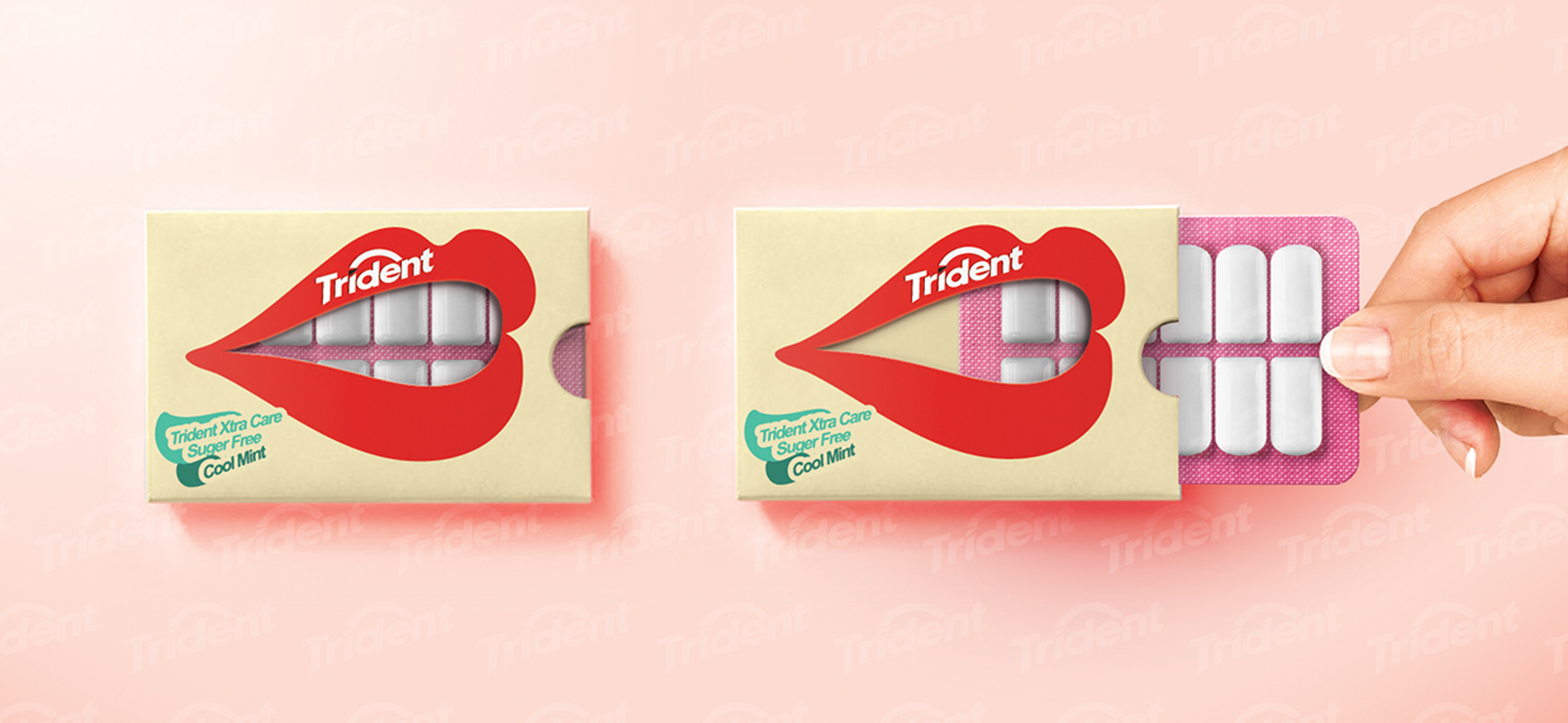
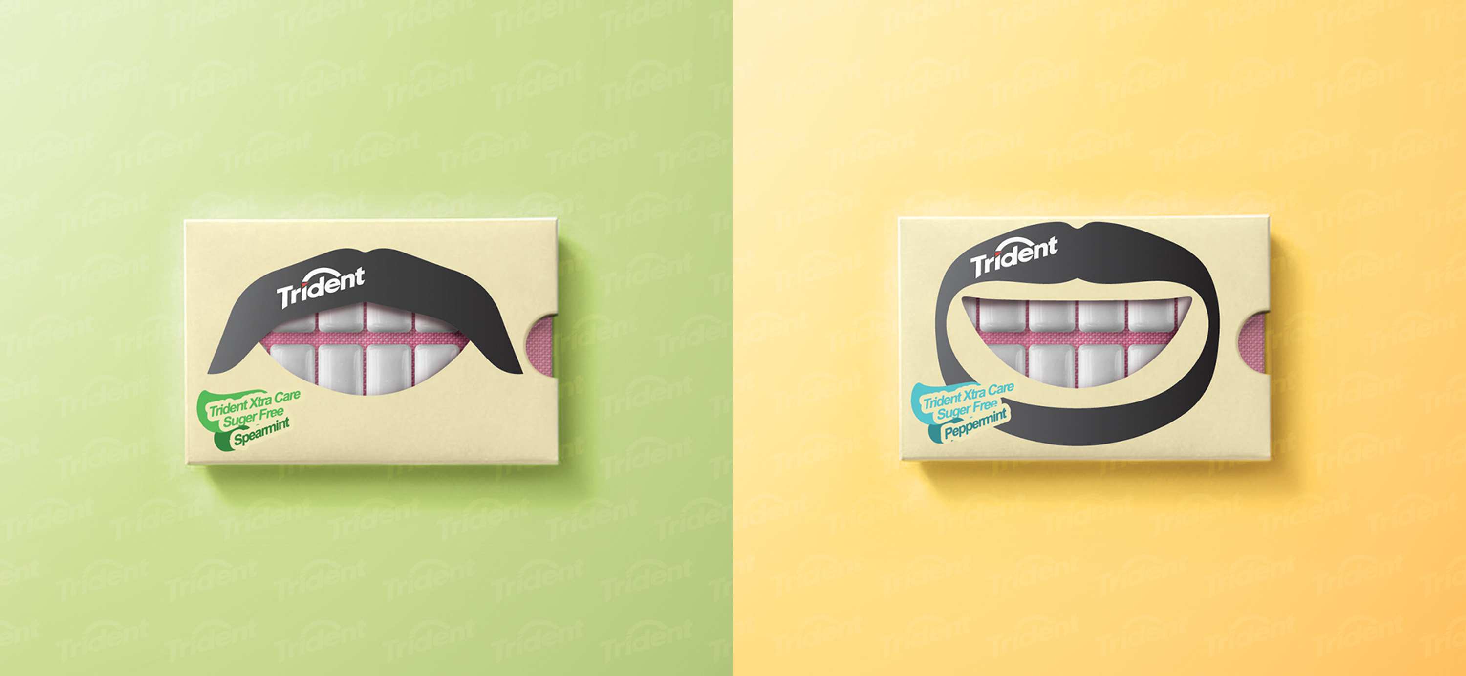
Trident really perfected the art of the smile with this clever and simple design concept and created something that’s interactive and quirky.
Shock
“Bread rolls”, “baps”, ‘buns”, whatever your preference, they’re a staple in terms of packaging innuendo. We’ve seen the half-dozen buns in clear packaging with a bra, the clear packaging to make them look like a buff six-pack… Whether representing the bum, the boobs, or the stomach, packaging has capitalised on the low-hanging fruit that buns/baps/rolls provide.
And then there was the bikini box that had the naked women’s back… You’d untie the bikini to open the pack. Saucy.
The shock factor gets attention, and people talk about it. Another benefit is that it also tends to go viral on social media.
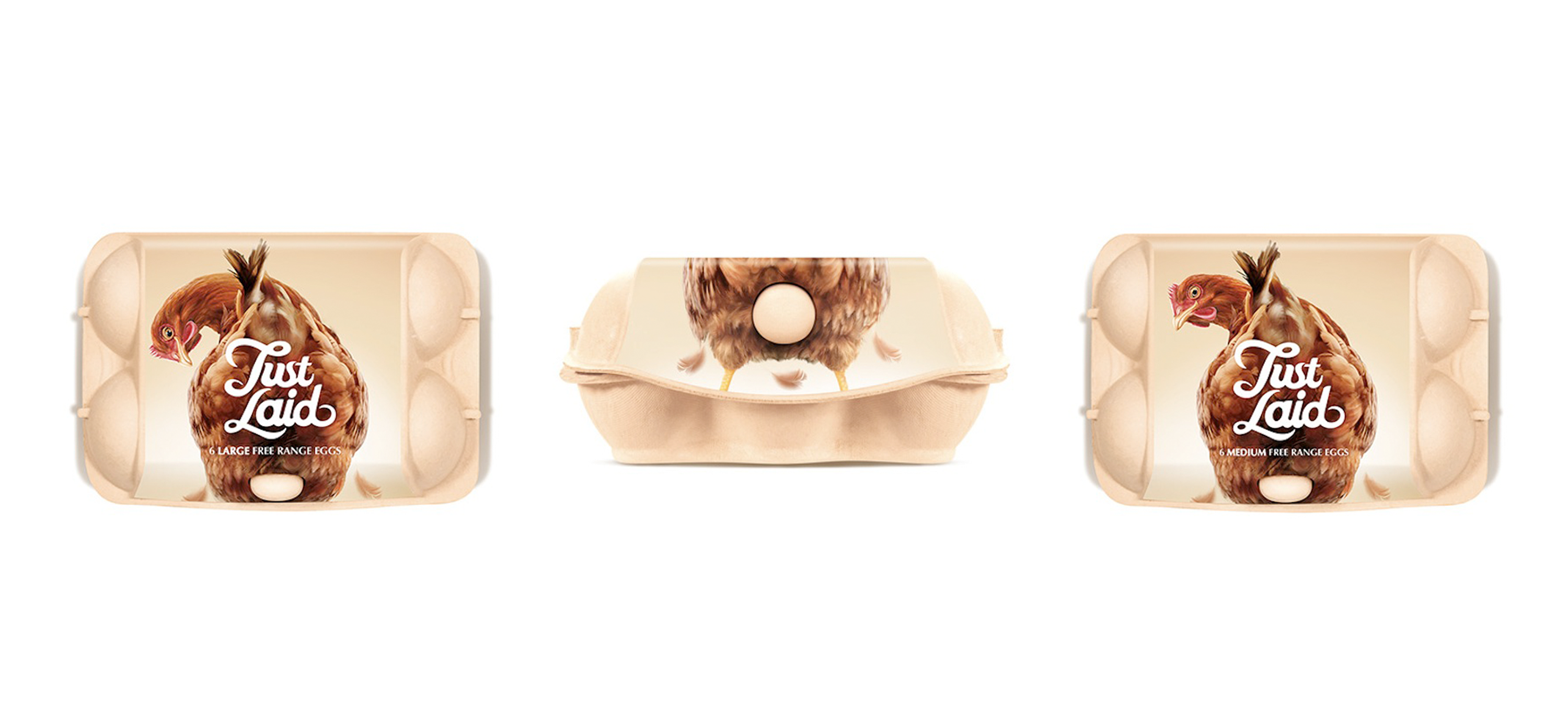
Springetts Brand Design Consultants used shock and humour for Just Laid Eggs to make customers scramble for the product (I promise that’s the only egg pun). Because, let’s be honest, egg packaging is boring at best and could use some eggcitement (sorry I lied). The Just Laid concept uses standard egg box packaging with quirky representations of laying hens where the box fastening looks like a fresh egg. The whole concept is very witty and clever and highlights freshness and the natural element.
Storytelling
We respond to stories because we emotionally connect to them. As with the supermarket Christmas adverts in the UK, anything that captures emotion is a great strategy to foster connection and brand loyalty. Innocent fruit juices and smoothies achieved this with their “good for you and good for the environment” brand story. The Innocent packaging was also unique because it interpolated consumers with witty stories, questions, and fun facts on the labelling.
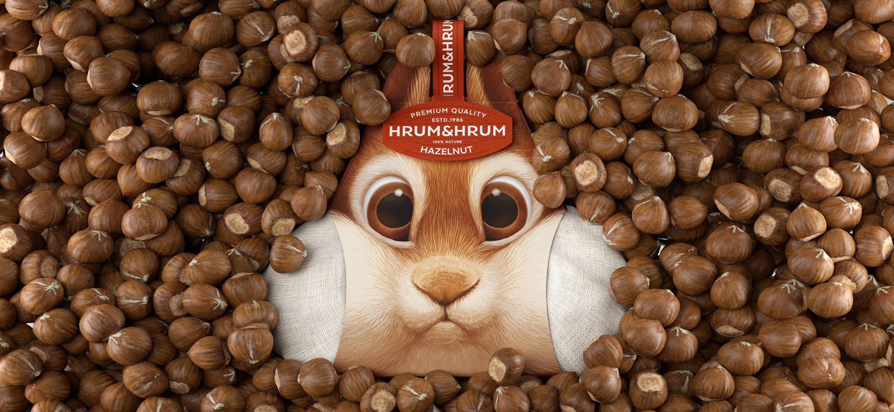
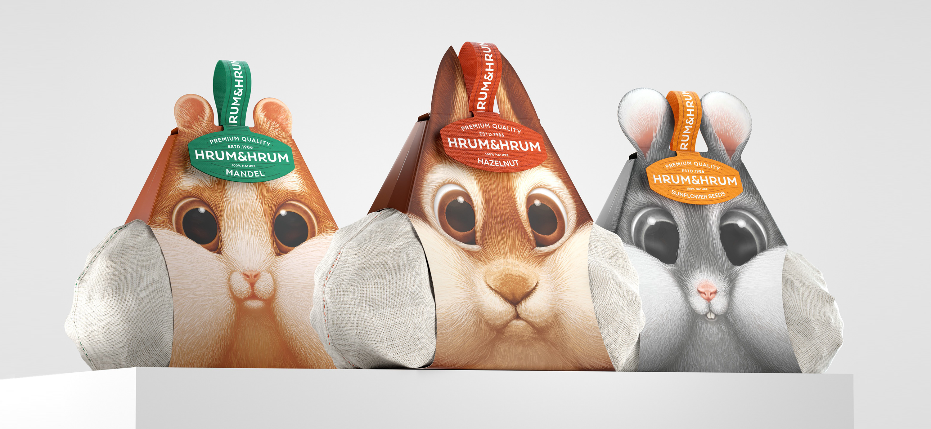
One of my favourite storytelling packaging designs is by Constantin Bolimond, illustrated by Tamara Vareyko. The concept they developed for Hrum & Hrum nuts and seeds included gorgeous illustrations of cute forest critters to link to our association of nuts and seeds with nature and furry friends. The clever packaging is also developed to resemble the animal’s cheeks filled with their stored nuts/seeds. The perfect representation of storing nuts and seeds for the winter.
Innovation
Sometimes, packaging shines because it breaks the mould and is just so innovative that you think to yourself, “How did they come up with that?!”
It’s especially surprising when these innovations are applied to staple products such as bread, milk, butter, etc. Milk is an essential, so no one really cares about what it looks like on the shelf. Or do we?
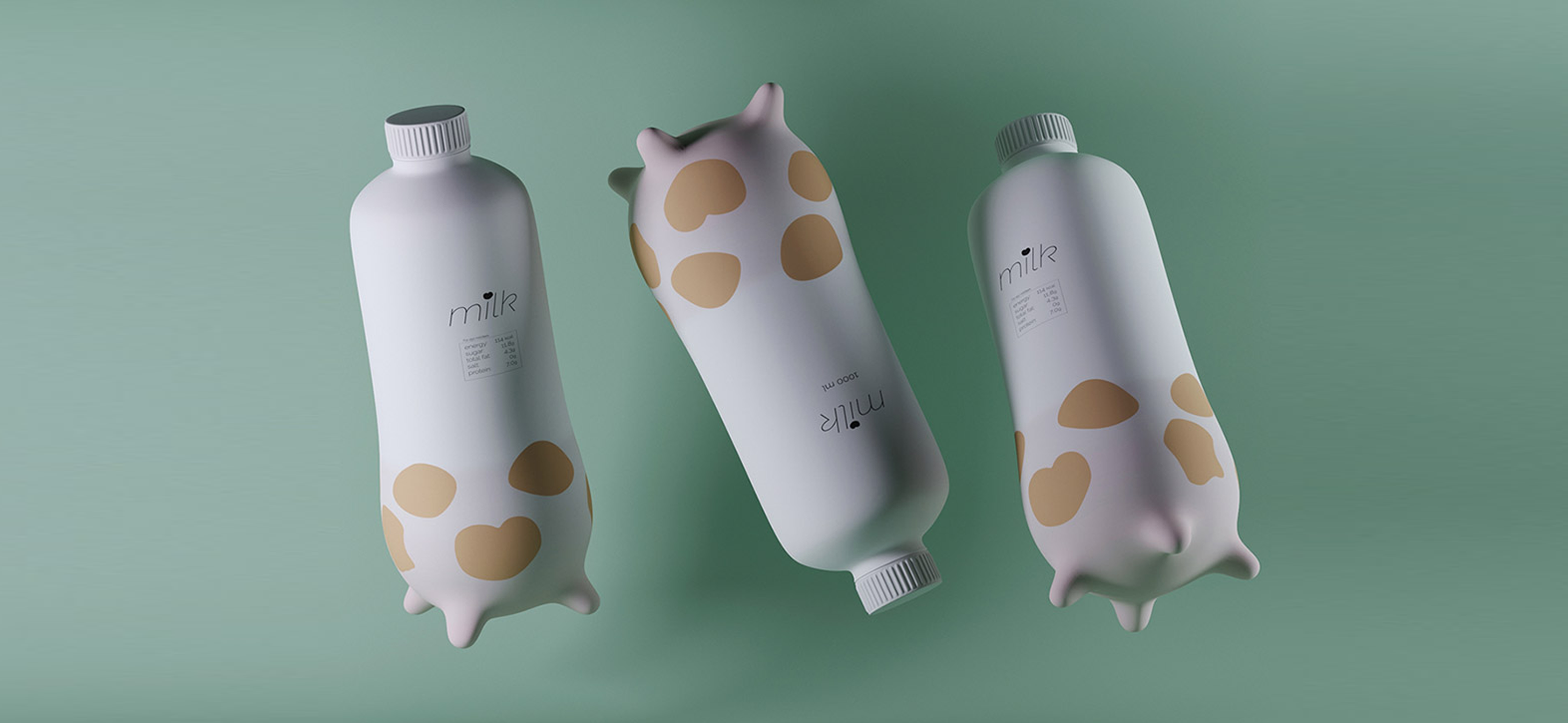
Muhammet Uzuntas, a packaging designer extraordinaire, developed an incredibly cool concept to reimagine milk. The bottle is shaped like cow udders, and this feature isn’t just for aesthetics and to look “cute”, but they also allow the bottle to have stability on the shelf.
Clever Concepts
Have you ever looked at packaging and thought – “Oh that is smart.”
Smartness is memorable– we remember a lot of adverts because they’re clever and they stick with us. We discuss them around the water cooler, watering hole, or watering can (whatever office preferences happen to be) because they’re a talking point.
The bottom line is that if you can be ‘clever’ conceptually, you can get the consumers' attention. Clever concepts set you apart from other designers because clients are looking to sell their products.
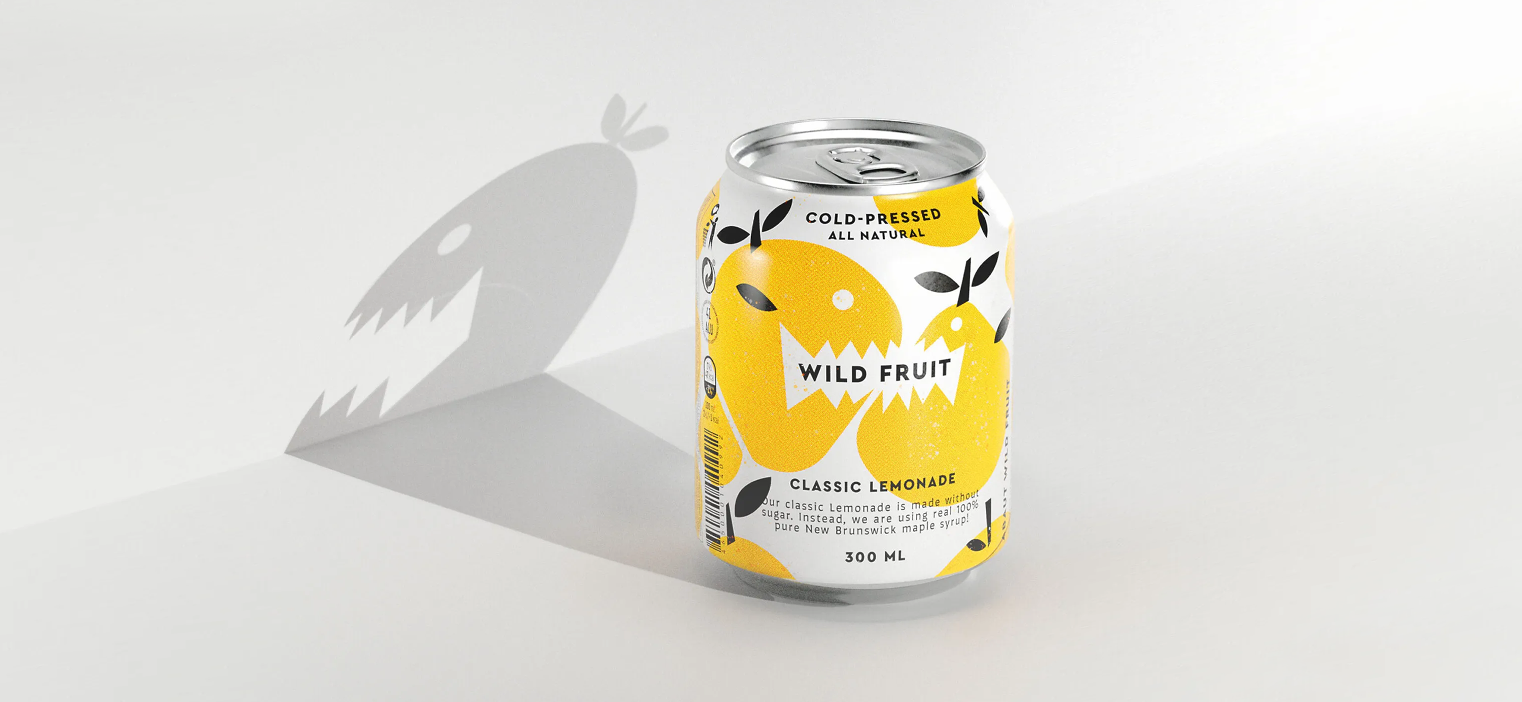
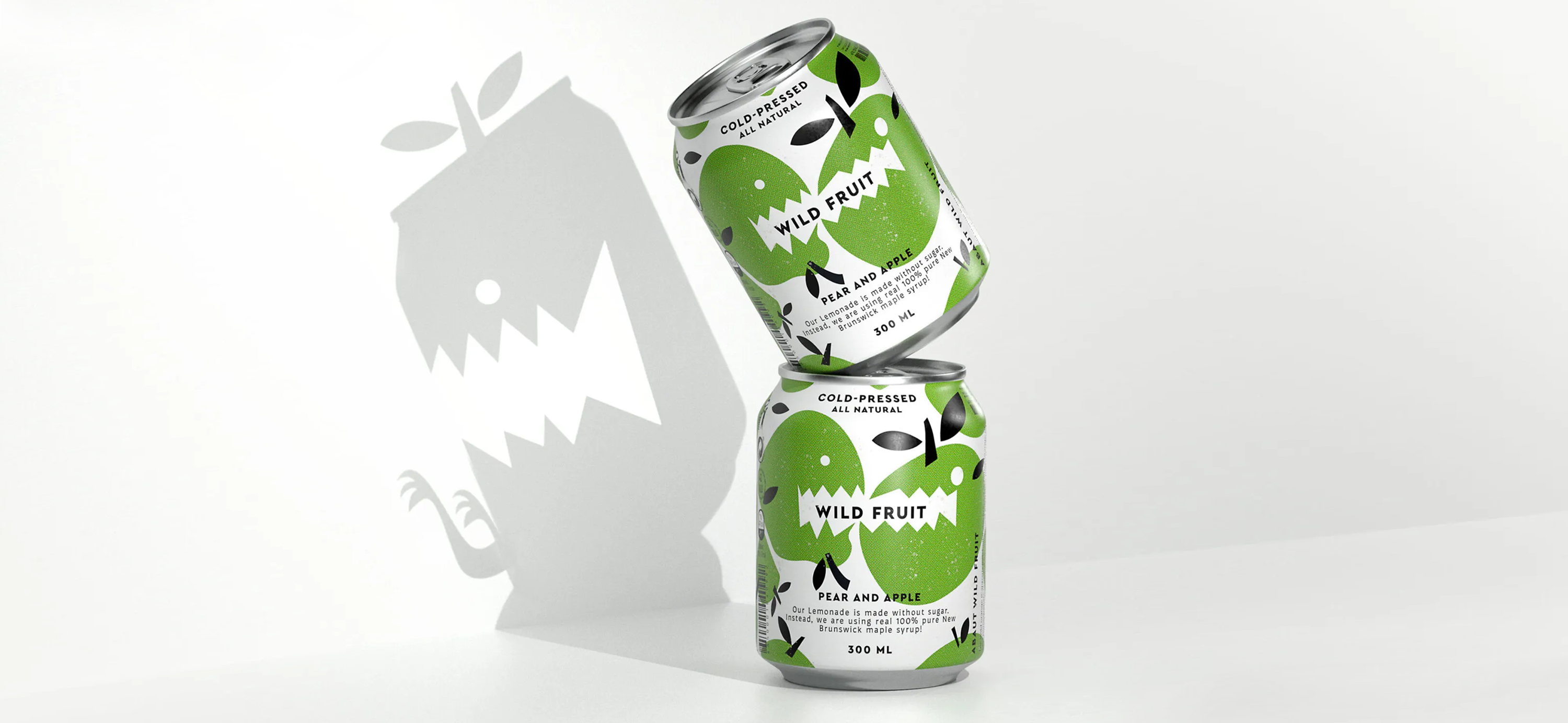
Take Wild Fruit… This advertising campaign is an absolute showstopper. While I believe the packaging design itself is a little bit safe and generic, the photographic campaign is a knockout. It’s clever because the shadows on the wall make the characters on the cans come to life– it shows their wild side. The cute characters reveal their inner monster, their hidden character, by coming to life through shadows. The whole concept is delightfully charming and you connect with the characters because they’re brought to life through the story.
Sensuality & Tactility
Some products are suited to sensuality and tactility. As the saying goes, “sex sells”.
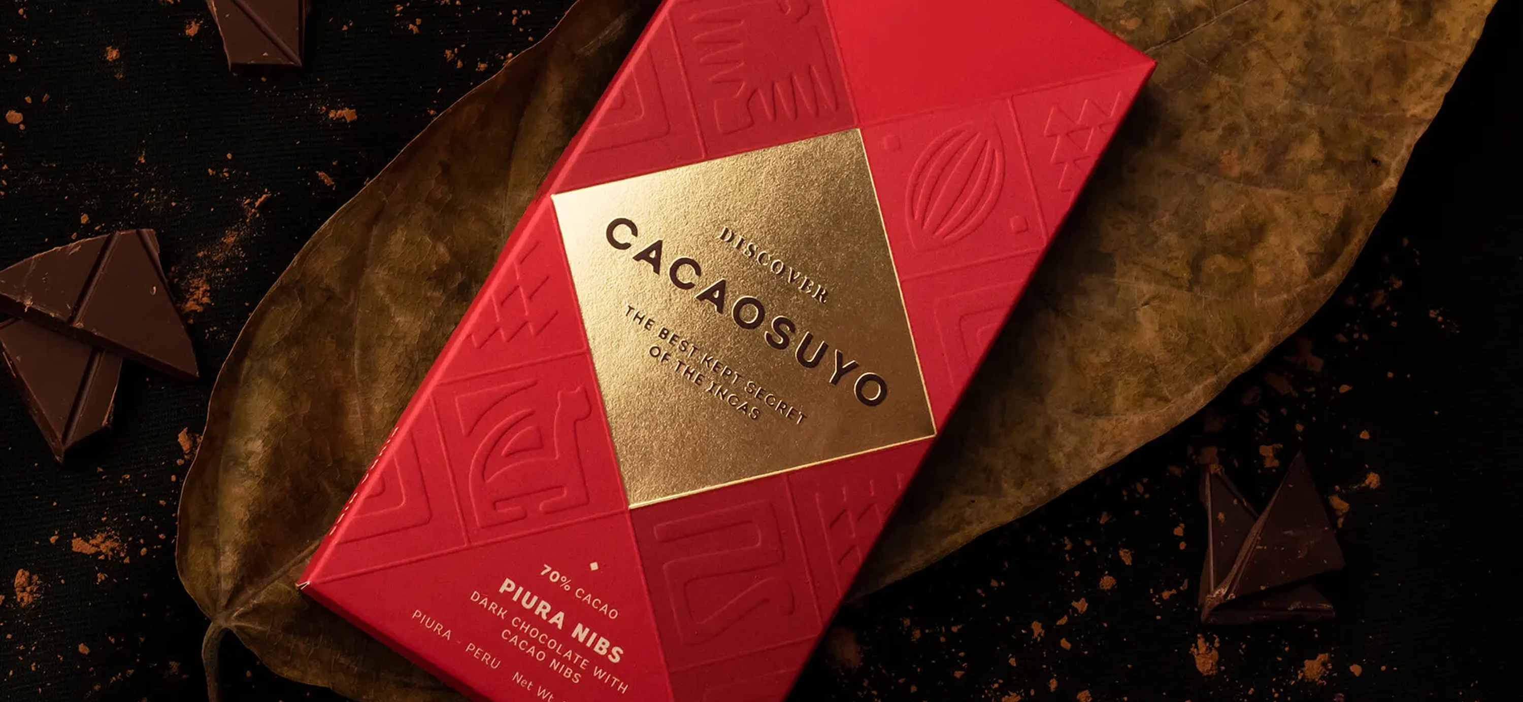
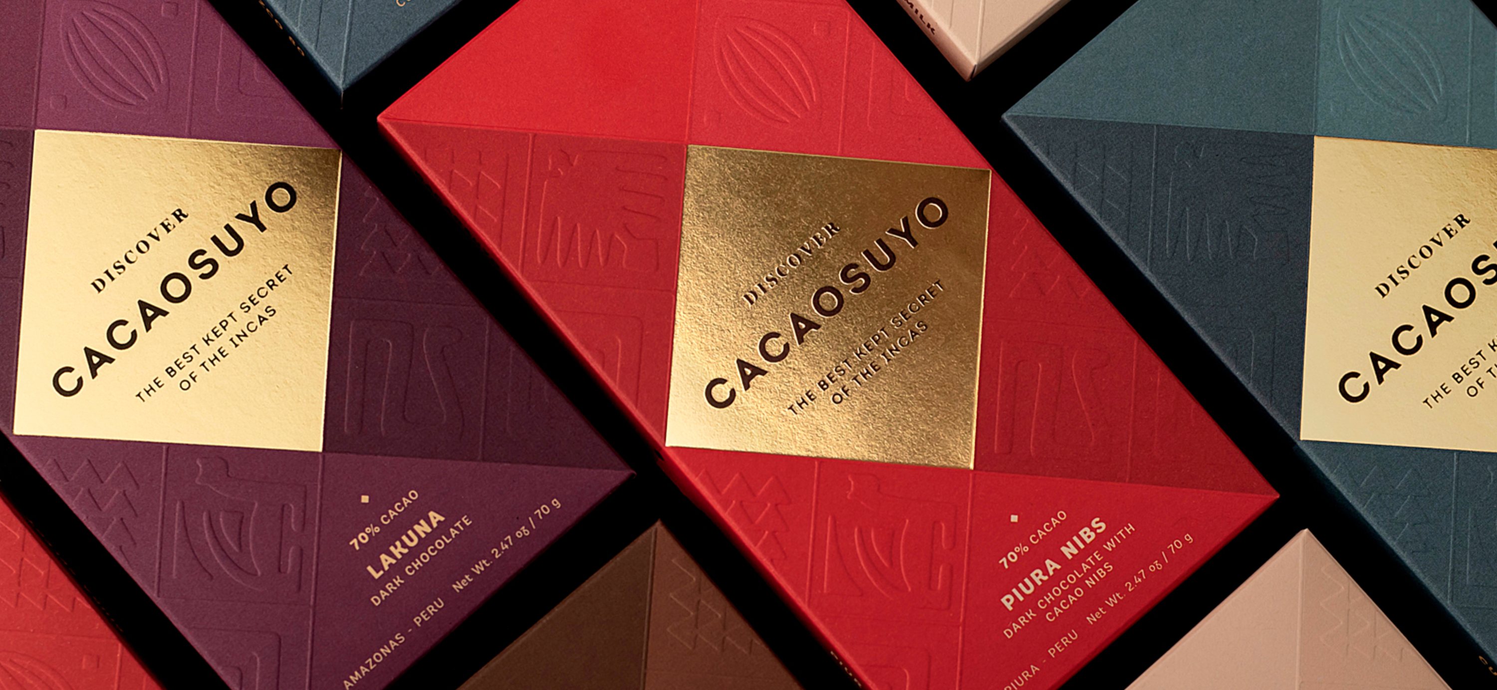
Chocolate packaging is a key example of packaging that uses these elements to attract customers. You’ll notice that most chocolate presentation boxes rely on a variety of textures that allow you to feel the pleasure of the chocolates. Whether it’s varnishes, embossing, or debossing, there are so many ways to create visual interest and create an intense feeling where you want to reach out and touch the packaging. It’s as if you cannot resist the temptation of reaching for the box, and then reaching for another chocolate– “Just one more.” Fibra's sensually-inspired Cacaosuyo chocolate uses a plethora of effects to enhance the design.
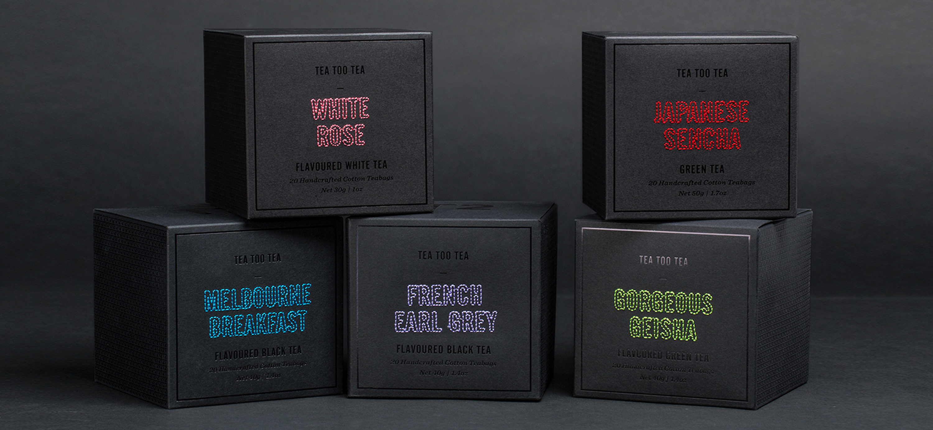
T2 Tea’s in-house design team used tactility to completely transform our idea of how tea should be packaged. They showed that they are masters of adding tactile and sensual elements to their designs. The labelling on the box, designed to look like hand stitching, echoes the contents of the box– cotton tea bags. The stitched effect stands out against the simplicity of the rest of the box and there’s an overwhelming temptation to reach out and run your fingers over it.
So what’s the lesson?
In the film, The Usual Suspects, the character Keyser Soze is brought to life through storytelling. And then, through more intrigue, more interest, in more clever twists, he became mythologised, a legend.
Every brand wants to be iconic and wants to have not just shelf presence, but presence in the culture of a place.
I believe that every brand has the potential to shine, but it’s up to us to keep pushing boundaries and tell the best stories to make them come to life.